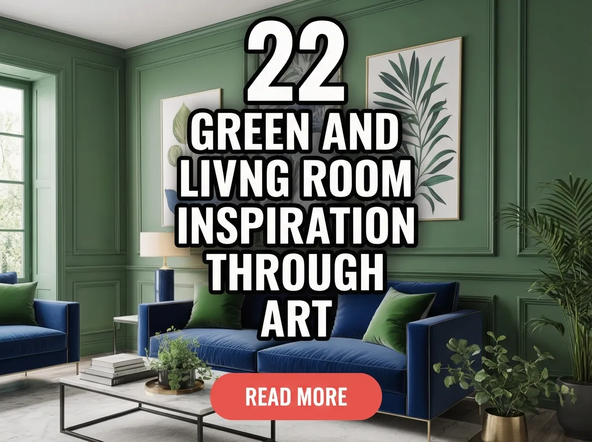
22 green and blue living room inspiration ideas through art focus on using artwork to balance color, mood, and visual flow. These ideas combine abstract, nature-inspired, and textured pieces in green and blue tones. Each approach helps create a calm yet expressive living room. The goal is a cohesive, art-driven color story.
22 Green And Blue Living Room Art Ideas
- Large abstract green and blue canvas
- Botanical wall art with deep green tones
- Ocean-inspired blue artwork
- Minimal line art with green accents
- Layered art gallery in green and blue palette
- Watercolor art with soft blue wash
- Landscape art with forest and sky balance
- Textured art panels in green hues
- Blue geometric wall art
- Mixed-media art using green pigments
- Framed textile art with blue threads
- Oversized green focal artwork
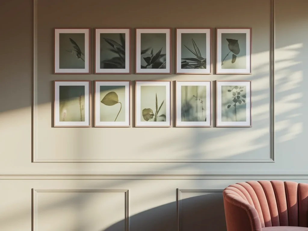
- Muted green and blue photography prints
- Art triptych with green-blue gradient
- Hand-painted mural in green and blue
- Sculptural wall art with green finish
- Vintage-inspired blue artwork
- Green abstract art above sofa
- Blue art with white negative space
- Nature-inspired art pairing green and blue
- Minimal art shelf with green-blue pieces
- Final green and blue art balance rule
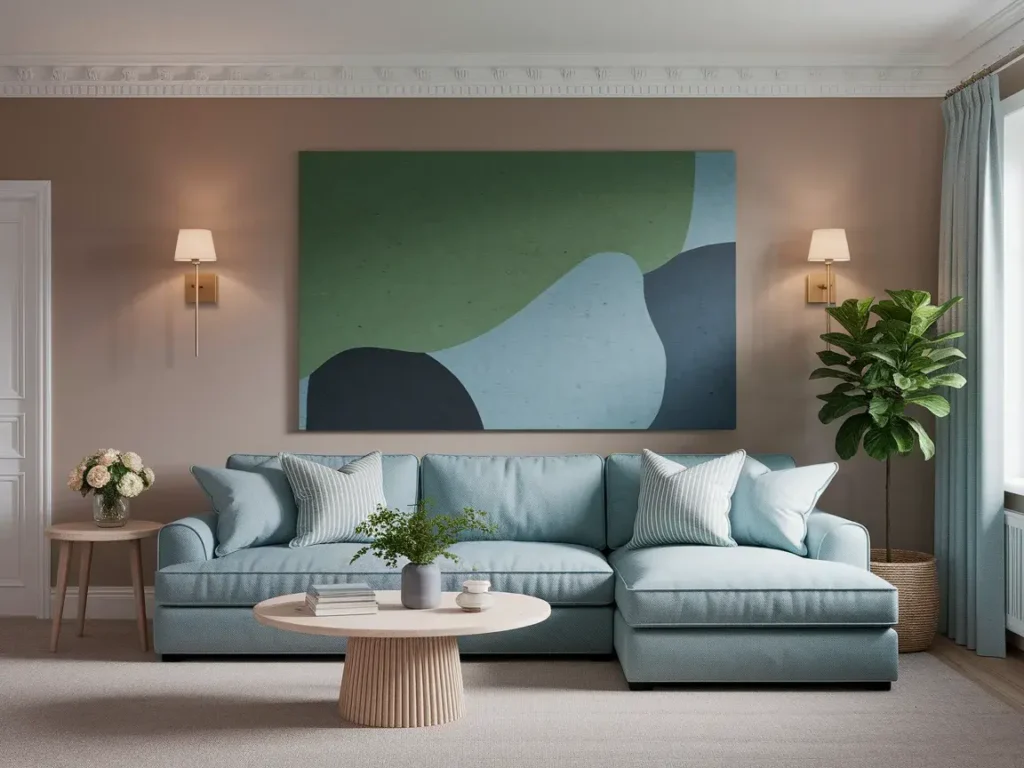
Large Abstract Green And Blue Canvas
A large abstract green and blue canvas works as a strong anchor in a living room. Abstract forms allow color to lead without forcing a theme. Green and blue shapes create calm movement across the wall. Large scale matters because it prevents the colors from feeling scattered or weak.
This type of artwork works best above a sofa or console. Surrounding walls should stay neutral so the art remains the focus. When one large piece controls the palette, the rest of the room feels balanced without extra effort.
Botanical Wall Art With Deep Green Tones
Botanical wall art introduces green through natural forms like leaves, stems, and branches. Deep green tones feel grounded and steady, which helps the living room feel relaxed. Botanical art works well when the room already includes simple furniture and light surfaces.
Placement should stay centered and uncluttered. One or two large botanical prints work better than many small ones. Pairing botanical art with soft blue accents in cushions or rugs keeps the color story connected without overuse.

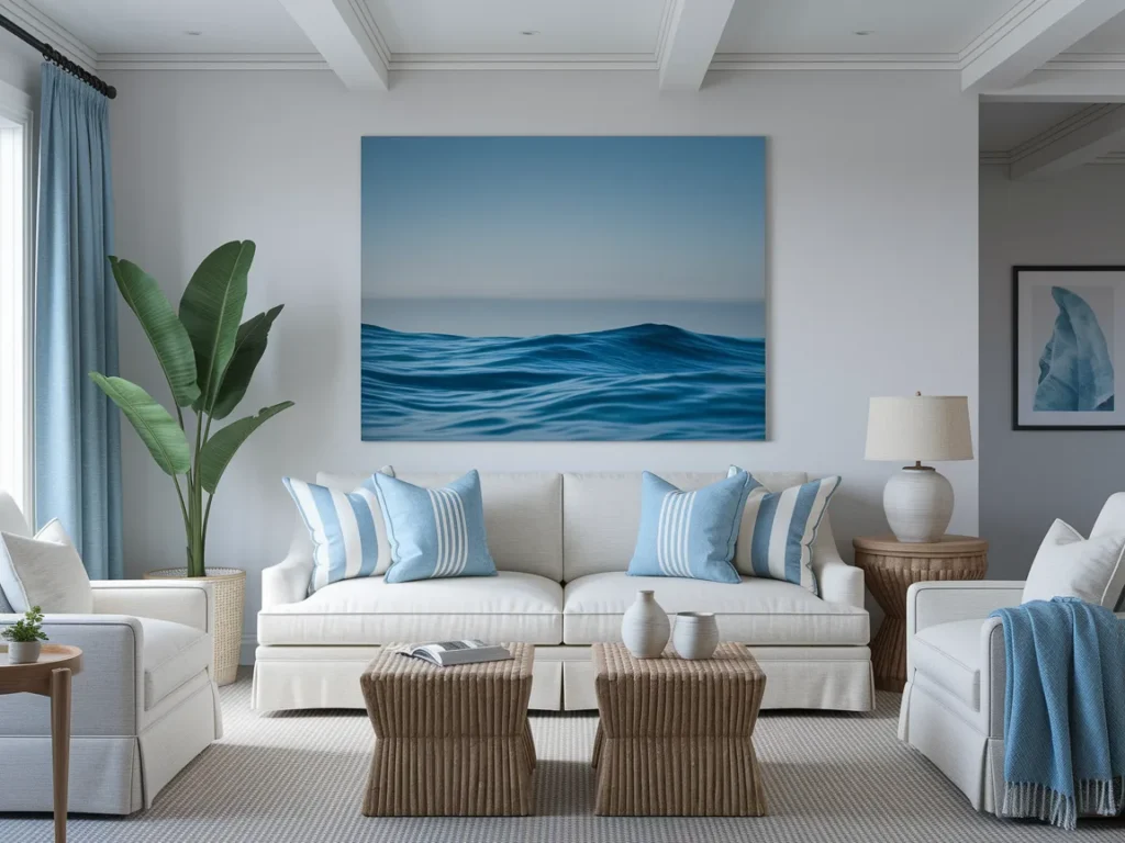
Ocean-Inspired Blue Artwork
Ocean-inspired blue artwork brings a calm and open feeling into a living room. Shades of blue drawn from water and sky create depth without heaviness. This type of art works well in rooms that need visual cooling or balance against warm furniture tones.
Ocean art should stay simple in composition. Wide horizons, soft waves, or abstract water textures read better than detailed scenes. Placing the artwork on a main wall allows blue to spread visually through the room without overpowering other elements.
Minimal Line Art With Green Accents
Minimal line art with green accents adds interest through simplicity. Thin lines keep the wall light while small green details introduce color gently. This approach works well in modern or minimal living rooms where clutter feels disruptive.
The artwork should use white or light backgrounds to maintain openness. Green accents should appear sparingly to avoid visual weight. Line art allows green to support the room rather than dominate it.
Layered Art Gallery In Green And Blue Palette
A layered art gallery in a green and blue palette creates rhythm and movement across a living room wall. The key lies in keeping the color range tight while varying scale and orientation. This prevents the gallery from feeling chaotic.
Frames should stay similar in finish and depth. Spacing must remain even to maintain order. Mixing abstract, botanical, and graphic pieces within the same color palette adds depth without losing cohesion.

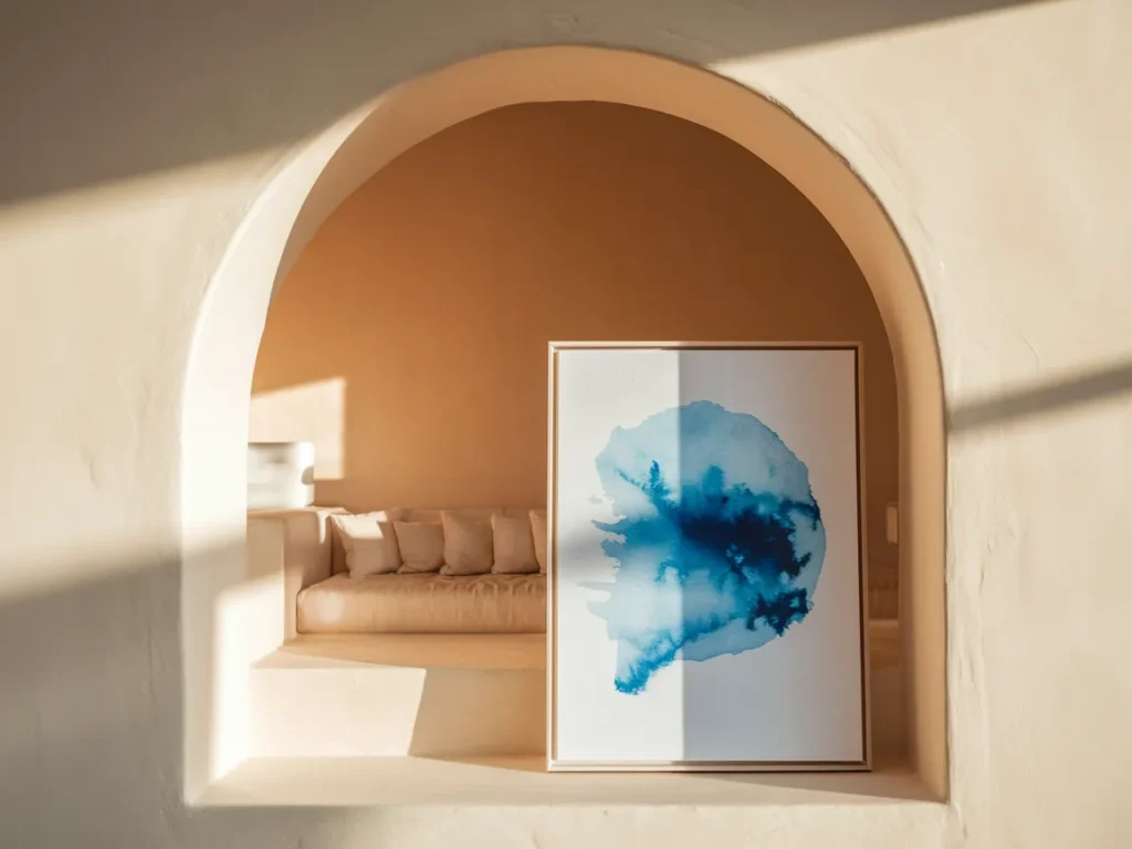
Watercolor Art With Soft Blue Wash
Watercolor art with a soft blue wash brings lightness and flow into a living room. The blended edges and gentle transitions keep the wall from feeling heavy. Blue watercolor works well in spaces that need calm without strong contrast.
This type of art suits quiet seating areas or reading corners. White or light mats help the blue feel airy. When paired with neutral walls, watercolor art spreads color softly without defining hard boundaries.
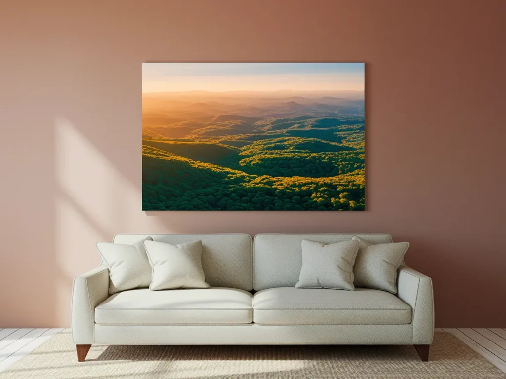
Landscape Art With Forest And Sky Balance
Landscape art that balances forest green and sky blue creates depth and stability. Green grounds the space, while blue opens it visually. This combination works well when the living room needs both warmth and calm.
The artwork should avoid heavy detail. Broad areas of color read better from a distance. Placing landscape art at eye level helps the colors connect naturally with furniture and flooring.
Textured Art Panels In Green Hues
Textured art panels in green hues add dimension through surface variation rather than color contrast. Subtle texture catches light differently throughout the day, giving the wall quiet movement.
Panels should stay limited in number and size. One or two panels work better than a full wall installation. Green texture pairs well with simple blue accents elsewhere in the room to keep balance.

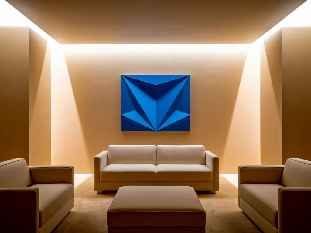
Blue Geometric Wall Art
Blue geometric wall art adds structure and rhythm to a living room. Clean shapes and clear lines help blue feel modern and controlled. This style works well in rooms with simple furniture and open wall space.
Geometric art should stay balanced in color weight. Too many shapes create noise. One strong piece or a pair of matching works keeps the wall organized while letting blue guide the mood.
Mixed-Media Art Using Green Pigments
Mixed-media art using green pigments adds depth through layered materials. Paint, fabric, or textured surfaces create visual interest without strong contrast. Green works well in mixed media because it feels natural and grounded.
Placement should allow breathing room around the piece. Mixed-media art benefits from soft lighting to reveal texture. Pairing it with subtle blue elements elsewhere keeps the palette unified.
Framed Textile Art With Blue Threads
Framed textile art with blue threads brings softness and detail into the living room. Woven or stitched patterns add interest without heavy color blocks. Blue thread details work well in neutral or light-colored rooms.
Frames should stay simple to let texture stand out. Textile art fits well in relaxed living spaces where comfort matters. Blue thread tones connect easily with cushions or throws.

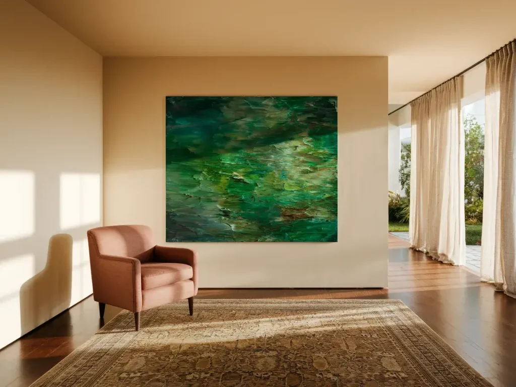
Oversized Green Focal Artwork
Oversized green focal artwork brings stability and calm into a living room. Large scale allows green to anchor the space without spreading across multiple walls. This approach works well when the room already has light furniture and neutral surfaces.
The artwork should sit on the main wall, often above seating. Surrounding decor should stay minimal so the green remains the focus. When one large piece controls the color, the room feels settled rather than busy.

Muted Green And Blue Photography Prints
Muted green and blue photography prints add realism and depth through natural tones. Landscapes, close-up textures, or abstract scenes work well when colors stay soft and desaturated.
Photography prints should stay consistent in tone and framing. Grouping two or three related prints works better than scattering many images. This keeps the wall calm while adding visual story.
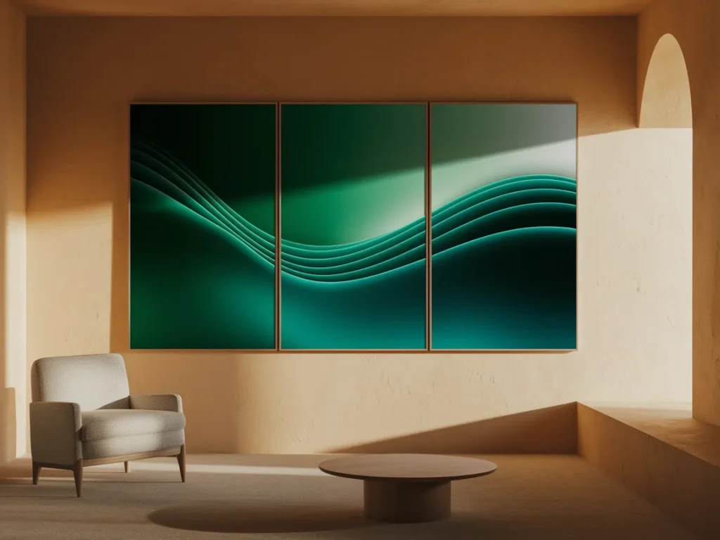
Art Triptych With Green-Blue Gradient
An art triptych with a green-blue gradient creates movement across the wall. Three connected pieces allow color to flow gradually rather than abruptly. This helps the living room feel balanced and intentional.
Spacing between panels should remain even. The gradient should move gently from green to blue or the reverse. Triptychs work well above sofas or long consoles where horizontal flow matters.
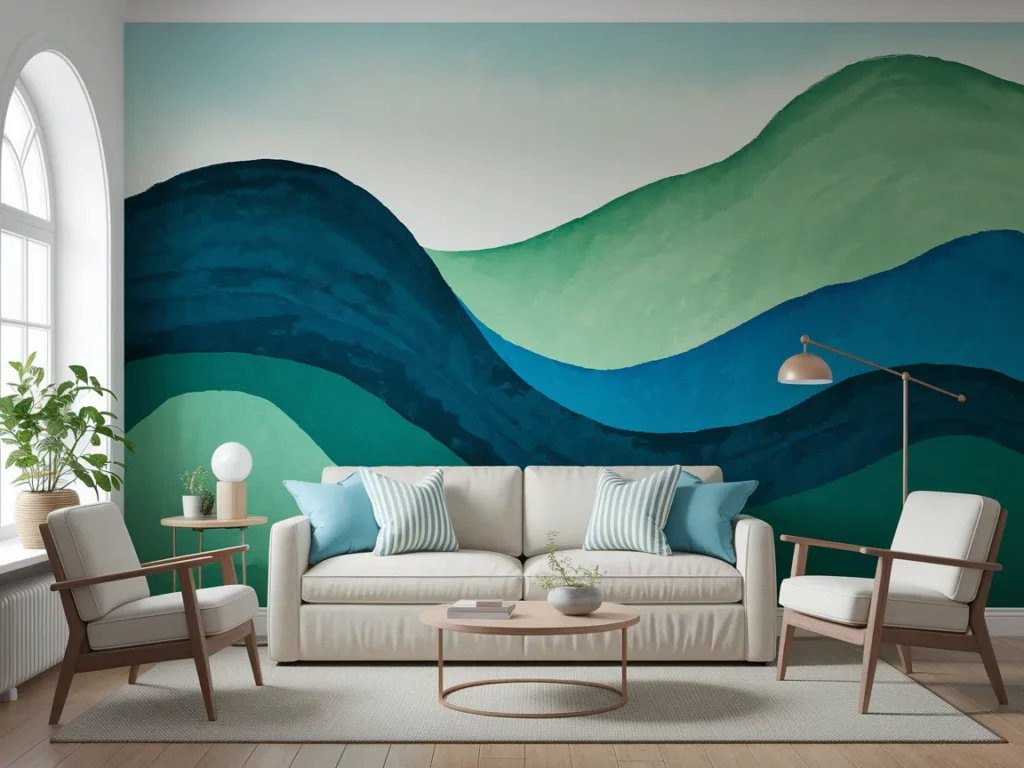
Hand-Painted Mural In Green And Blue
A hand-painted mural in green and blue creates a custom visual story across the living room wall. Large flowing shapes or soft gradients work better than detailed scenes. This keeps the mural calm and readable from different angles in the room.
Murals should stay limited to one wall to avoid visual overload. Furniture and decor near the mural should remain simple so the colors can breathe. When done with restraint, a mural turns the wall into a calm backdrop rather than a loud feature.
Sculptural Wall Art With Green Finish
Sculptural wall art with a green finish adds depth through form instead of color variation. Flat or shallow sculptural pieces work best so the wall does not feel heavy. Green finishes feel grounded and pair well with neutral surroundings.
Lighting should wash across the sculpture to highlight form. Avoid sharp spotlights that create harsh shadows. This type of art works well as a single focal piece rather than a collection.

Vintage-Inspired Blue Artwork
Vintage-inspired blue artwork adds character through softened tones and aged textures. Blue prints, illustrations, or faded patterns bring depth without sharp contrast. This style suits living rooms with relaxed or classic elements.
Frames should stay simple to avoid competing with the artwork. Vintage blue art pairs well with light walls and natural materials. When used sparingly, it adds warmth rather than nostalgia overload.

Green Abstract Art Above Sofa
Green abstract art placed above a sofa anchors the seating area and sets the room’s color direction. Abstract forms keep the focus on tone and movement rather than subject, which helps the art blend with different furniture styles. Green works well above seating because it feels steady and calming without pulling attention away from conversation.
Scale matters. The artwork should span a large portion of the sofa width to feel balanced. Surrounding decor should remain simple so the green can lead the palette naturally across cushions, rugs, or throws.
Blue Art With White Negative Space
Blue art with white negative space keeps the living room light and open. The white areas allow blue to stand out without feeling heavy. This approach works well in smaller rooms or spaces with limited natural light.
Artwork should feature clear separation between blue and white areas. Overly complex designs reduce clarity. When negative space stays generous, the room feels breathable while still carrying color.
Nature-Inspired Art Pairing Green And Blue
Nature-inspired art that pairs green and blue connects the living room to natural themes like water, plants, and sky. This combination feels balanced because green grounds the space while blue opens it visually.
Artworks should keep colors soft and blended rather than sharply divided. One or two pieces work better than many. Nature-inspired art supports calm and long-term comfort without forcing a theme.
Frequently Asked Questions
How Do Green And Blue Art Colors Affect A Living Room?
Green and blue art colors influence how calm and balanced a living room feels. Green supports stability and rest, while blue adds openness and depth. Together, they reduce visual stress and help the room feel settled. When used through art rather than paint, these colors feel easier to adjust over time. Art allows the palette to stay flexible while still guiding the overall mood of the space.
How Much Green And Blue Art Is Too Much?
Too much green and blue art can overwhelm the living room when it spreads across many walls or uses strong saturation everywhere. A better approach uses one main piece and a few supporting works. Leaving neutral wall space helps the colors stand out. Balance matters more than quantity. When art feels dominant during movement or conversation, the room likely needs fewer pieces.
Can Green And Blue Art Work In Any Living Room Style?
Yes, green and blue art works across many styles because these colors appear in nature and feel familiar. Abstract, botanical, geometric, and photographic art can all use green and blue effectively. The key lies in scale, tone, and placement. Softer shades suit relaxed spaces, while structured designs fit modern rooms. Art style should support the furniture, not compete with it.
Should Furniture Match Green And Blue Artwork Exactly?
Furniture does not need to match artwork exactly. Exact color matching often feels forced. Instead, repeat similar tones through small accents like cushions, throws, or rugs. Let the art lead and allow furniture to stay neutral. This keeps the living room flexible and prevents color fatigue over time.
Final Thoughts
Green and blue living room inspiration works best when art leads the color story. Art allows these colors to shape mood without locking the space into permanent choices. In real living rooms, balance improved when one main artwork guided the palette and supporting pieces stayed subtle. Large-scale art felt calmer than many small items. Soft tones worked better than strong saturation for long-term comfort. Negative space helped colors breathe, and neutral walls allowed art to stay flexible over time. When green and blue entered the room through thoughtful art placement, the living room felt composed, calm, and visually complete without excess decoration.
