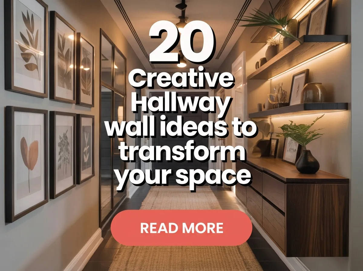
20 creative hallway wall ideas to transform your space focus on clean surfaces, visual continuity, and intentional wall design. These ideas use paint, texture, lighting, and art to add depth without crowding. Each approach helps enhance narrow or long hallways. The goal is a polished, balanced, and visually engaging hallway.
20 Creative Hallway Wall Ideas
- Full-height wall paint continuity
- Large-scale single artwork
- Vertical panel wall design
- Slim framed gallery wall
- Wall-mounted picture ledges
- Textured paint finish
- Monochrome wall palette
- Subtle wall murals
- Wall-integrated lighting
- Recessed wall niches
- Linear wall pattern design
- Soft contrast accent wall
- Mirror wall panels
- Flat sculptural wall relief
- Wall-based fabric panels
- Minimal graphic wall art
- Continuous trim alignment
- Wall color door blending
- Directional wall lighting
- Final hallway wall layout rule
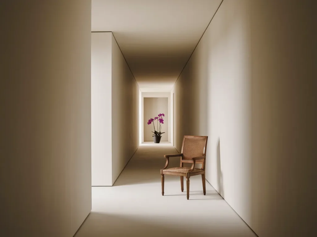
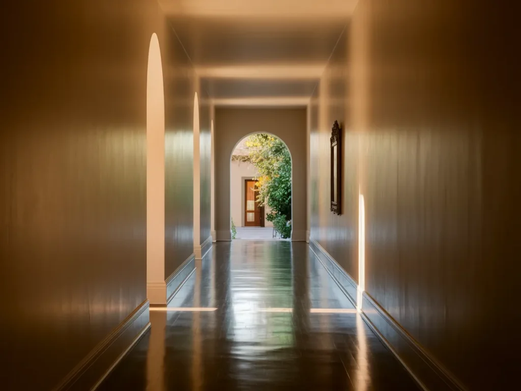
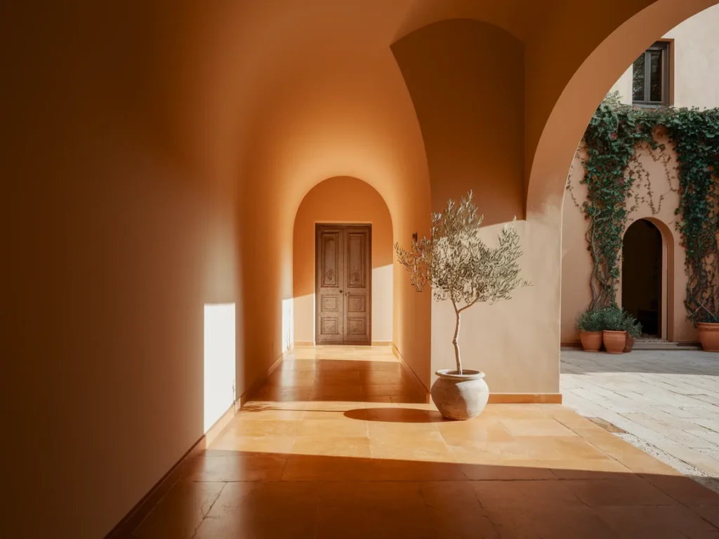
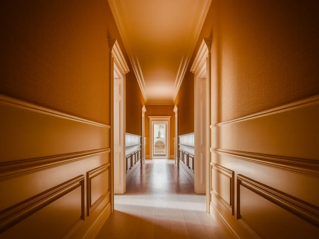
Full-Height Wall Paint Continuity
Full-height wall paint continuity uses one color from floor to ceiling to remove visual breaks. When the wall reads as one surface, the hallway feels longer and calmer. Light or mid-tone colors help reflect available light and reduce shadows along edges.
Keeping trim and door frames close in color prevents interruptions. Strong contrast creates stops that shorten the space. A continuous wall color allows the eye to move forward without distraction, which improves comfort while walking.
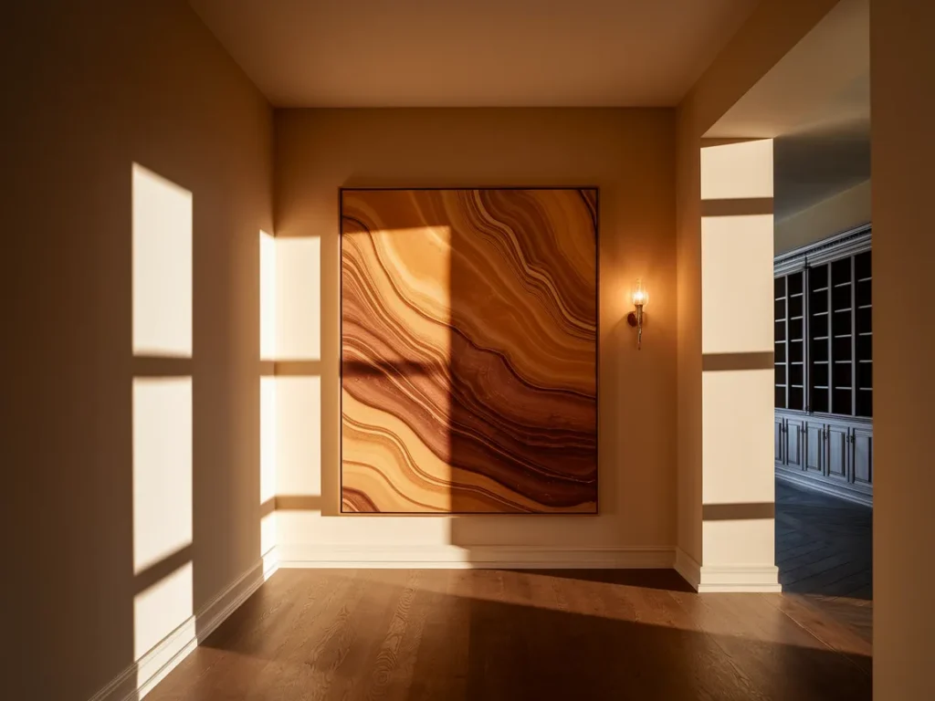
Large-Scale Single Artwork
Large-scale single artwork adds character without clutter. One oversized piece works better than several small frames in a hallway. The artwork should sit at eye level and remain centered on the wall for balance.
Simple subjects and limited color palettes work best. Highly detailed art loses clarity in narrow spaces. A single strong piece creates focus while keeping the hallway wall clean and readable.
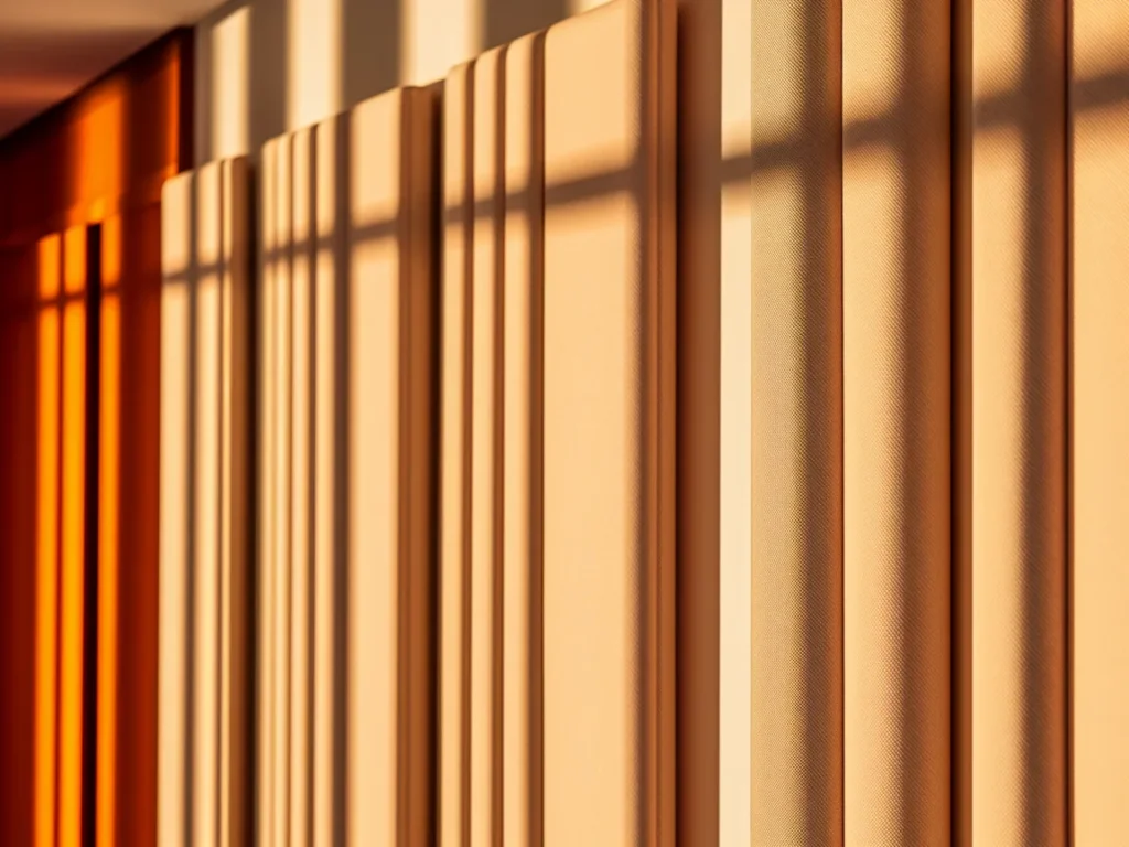
Vertical Panel Wall Design
Vertical panel wall design uses slim vertical lines to improve proportion. Vertical lines pull the eye upward and make walls feel taller. This reduces the boxed-in effect common in hallways.
Panels should stay shallow and painted in light tones. Heavy textures or deep grooves reduce the benefit. Vertical panels add structure without adding objects, which keeps movement clear.
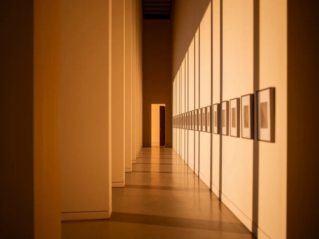
Slim Framed Gallery Wall
A slim framed gallery wall allows multiple pieces without blocking space. Frames must stay thin and flush against the wall. Even spacing keeps the layout calm and organized.
Using fewer pieces improves clarity. Neutral frame colors help the art blend into the wall surface. This approach adds personality while keeping the hallway visually light.
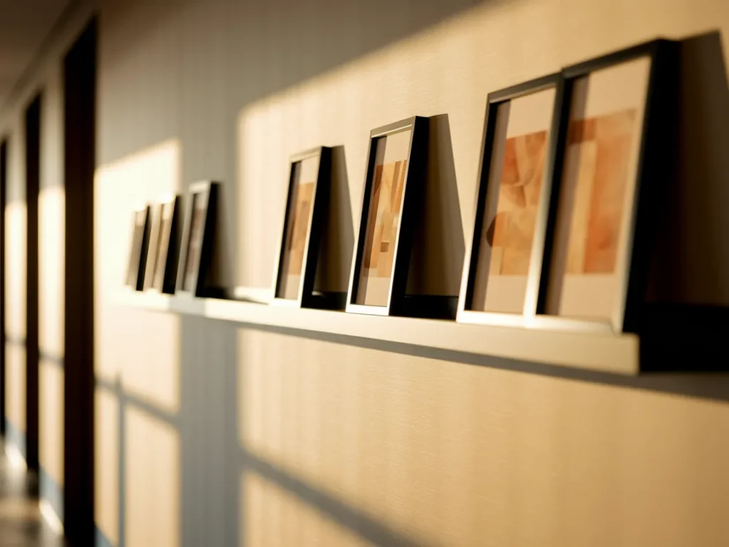
Wall-Mounted Picture Ledges
Wall-mounted picture ledges add flexibility without blocking movement. Ledges should stay shallow so the wall remains flat. This allows artwork rotation without new holes or clutter. Ledges work best when mounted at eye level and used in short runs rather than across the full hallway.
Only a few items should sit on each ledge. Overloading creates visual noise. Neutral frames and simple objects keep the wall calm while still personal.
Textured Paint Finish
Textured paint finish adds depth through surface variation rather than objects. Subtle textures like limewash or soft plaster catch light differently across the wall. This creates interest without reducing space.
Textures should stay light and consistent. Heavy or rough textures overwhelm narrow hallways. When texture stays shallow, the wall feels richer while remaining smooth.
Monochrome Wall Palette
A monochrome wall palette uses one color family across the hallway. Shade variation adds depth while avoiding contrast breaks. This keeps the hallway visually unified and calm.
Texture and material differences replace color change. Monochrome walls help the space feel longer and more controlled during movement.
Subtle Wall Murals
Subtle wall murals add interest without dominating the space. Murals should stay light in tone and simple in pattern. Large soft shapes work better than detailed scenes.
Murals should cover one main wall or end wall only. Overuse shortens the hallway visually. When kept restrained, murals add character without crowding.
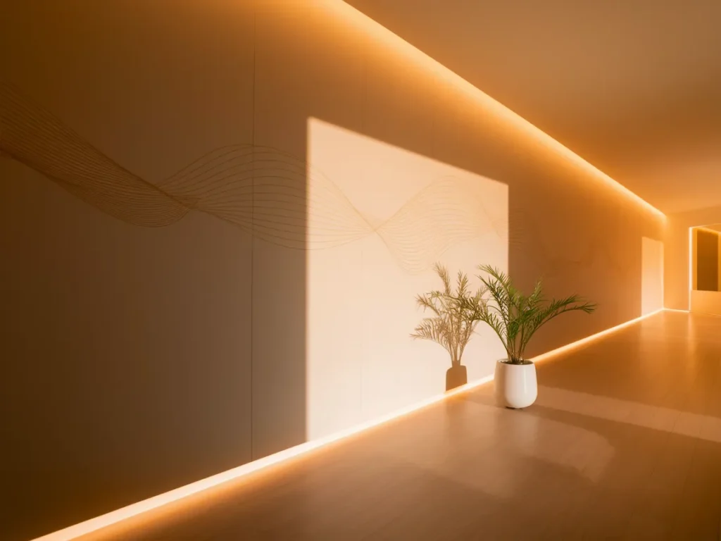
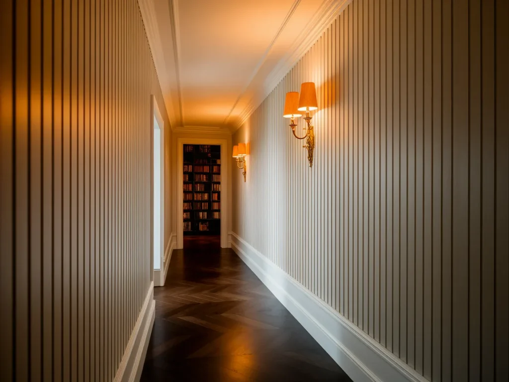
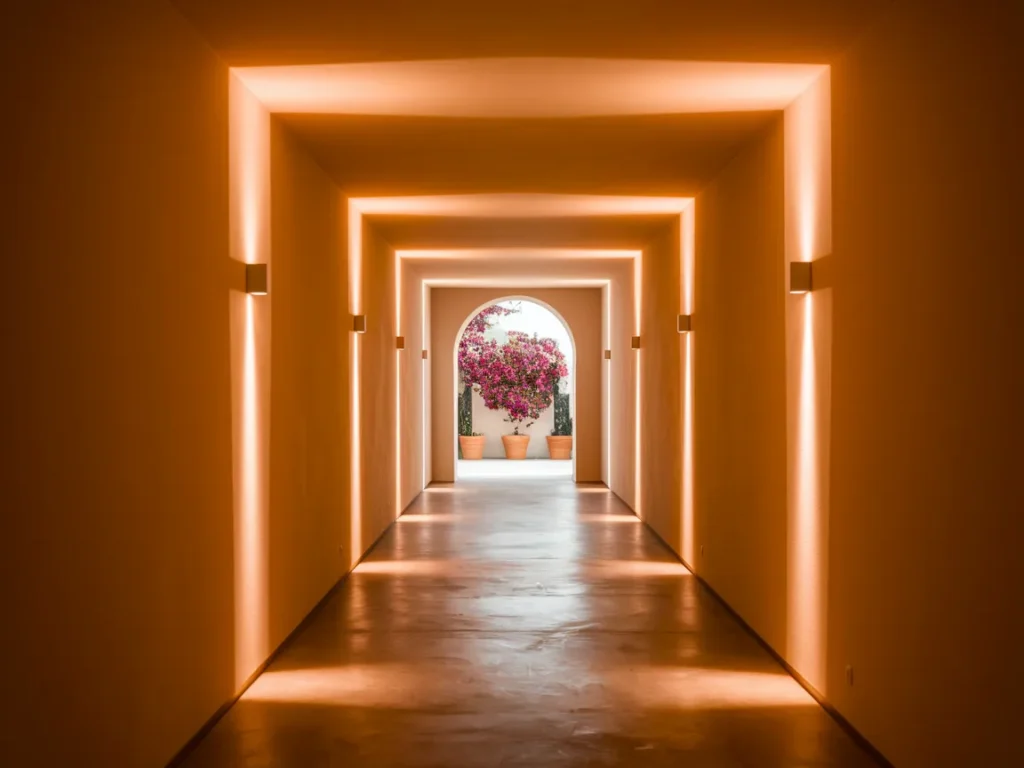
Wall-Integrated Lighting
Wall-integrated lighting improves brightness while keeping floors clear. Recessed lights, slim sconces, or hidden LED strips work best. Light should wash the wall rather than aim downward.
Even spacing keeps the hallway balanced. Warm light improves comfort during movement. Integrated lighting makes walls part of the function, not just decoration.
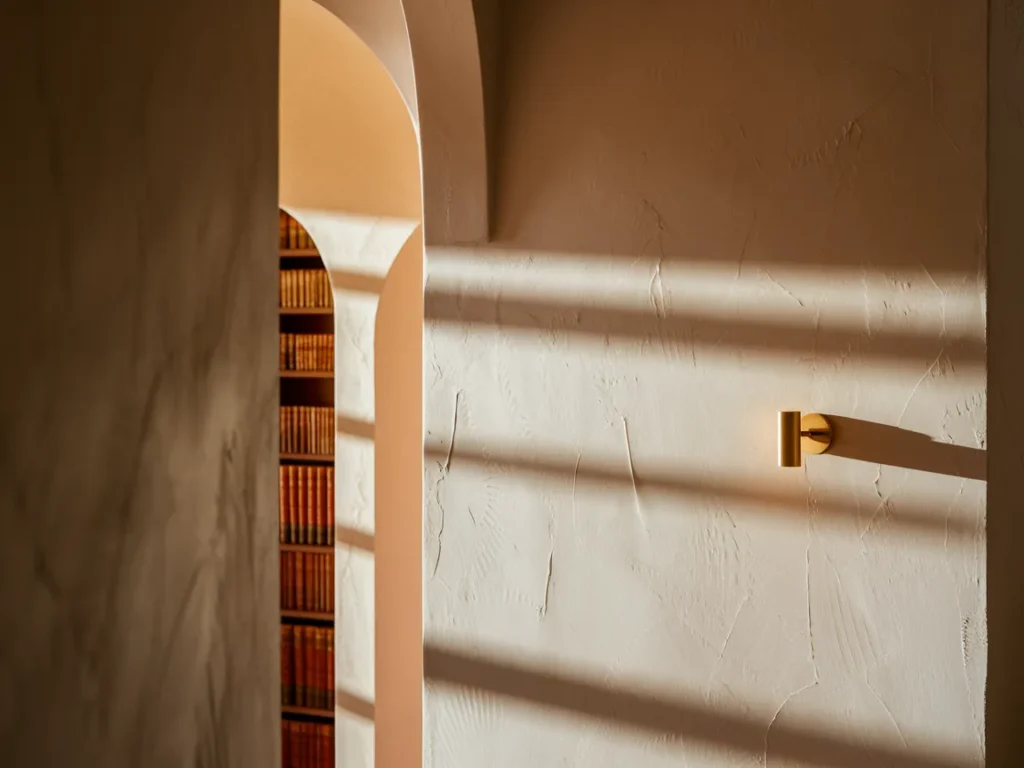
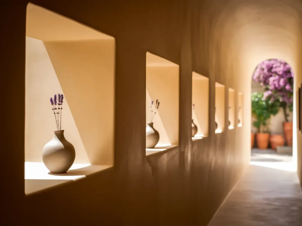
Recessed Wall Niches
Recessed wall niches add function without reducing hallway width. Niches sit inside the wall plane, which keeps movement clear. They work well for small objects, books, or soft lighting. The depth should stay shallow to avoid shadow pockets.
Spacing between niches should feel even. Too many niches create clutter. When used with restraint, niches add interest while keeping the wall flat and calm.
Linear Wall Pattern Design
Linear wall pattern design guides the eye along the hallway length. Horizontal or vertical lines painted or lightly textured create direction. Lines should stay thin and evenly spaced.
Strong contrast breaks the effect. Subtle patterns work best in narrow spaces. Linear designs help the hallway feel intentional and structured.
Soft Contrast Accent Wall
A soft contrast accent wall adds depth without shrinking the space. Accent walls work best at the end of the hallway or on short wall sections. The color should stay close to the main wall tone.
High contrast reduces width perception. Soft contrast adds focus while keeping flow smooth. This method works well when the hallway feels long or plain.
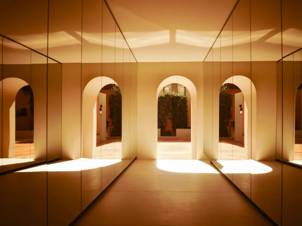
Mirror Wall Panels
Mirror wall panels increase brightness and perceived width. Large mirror sections work better than many small mirrors. Panels should stay flush with the wall to avoid depth.
Mirrors reflect light and movement, which reduces the tunnel effect. Placement along one long wall creates the strongest impact without visual confusion.
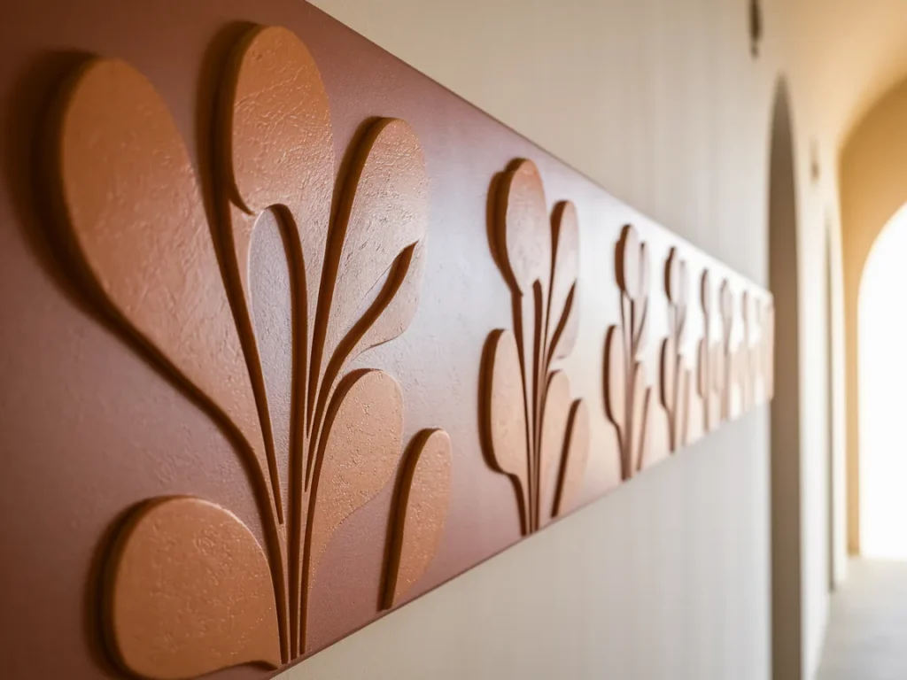
Flat Sculptural Wall Relief
Flat sculptural wall relief adds artistic interest without protruding into the walkway. Relief designs should stay shallow and smooth. Organic or geometric shapes work well.
Strong shadows reduce clarity. Even lighting helps relief details stay readable. Flat relief creates texture while preserving space.
Wall-Based Fabric Panels
Wall-based fabric panels add softness without blocking movement. Panels stay flat against the wall and absorb sound, which improves comfort in long hallways. Fabric should remain smooth and lightly textured rather than thick or padded.
Neutral tones work best to avoid visual heaviness. Panels should appear in limited sections instead of covering every wall. When fabric stays controlled, the hallway feels warmer without feeling crowded.
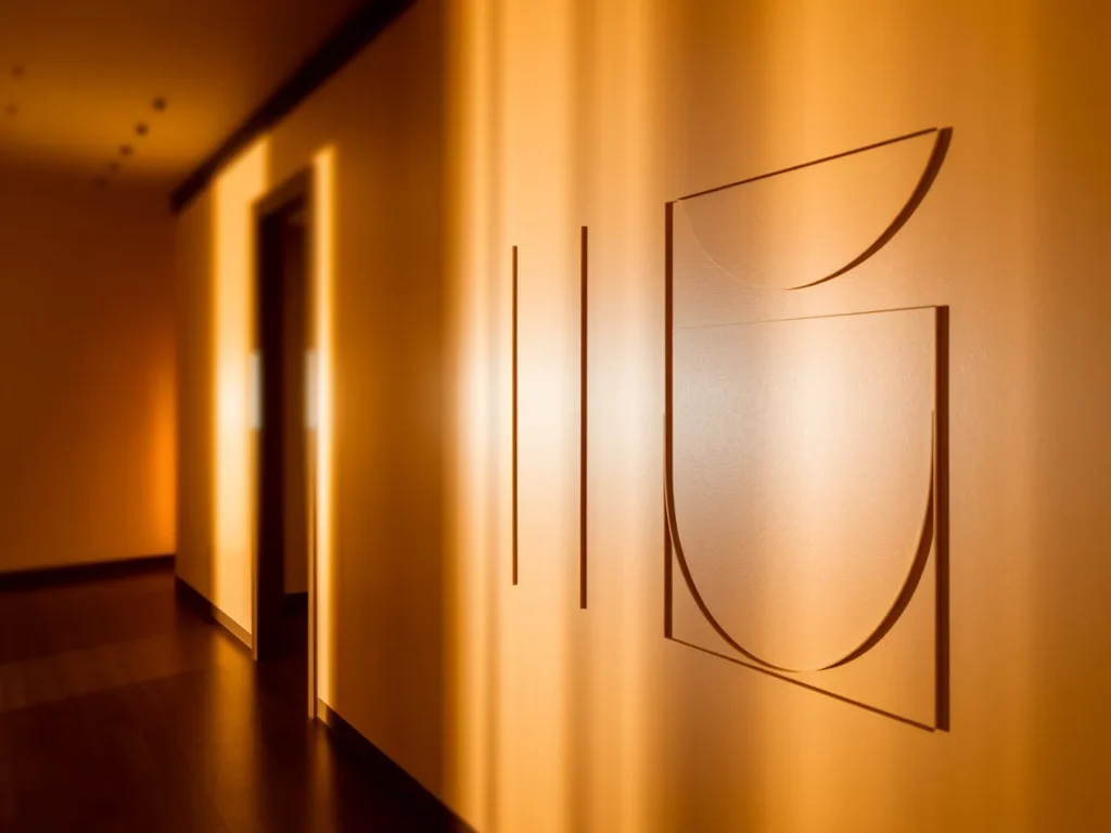
Minimal Graphic Wall Art
Minimal graphic wall art adds style through simple shapes and lines. Bold graphics with limited color keep walls visually clear. This approach works well when the hallway already has strong light.
Art should stay large and spaced out. Too many graphics reduce clarity. Minimal designs keep the hallway energetic while preserving calm movement.
Continuous Trim Alignment
Continuous trim alignment creates order by keeping trim height consistent across walls and doors. This visual line helps guide the eye forward and reduces visual breaks.
Trim should stay slim and close to wall color. Heavy trim adds depth and shadow. When trim aligns smoothly, the hallway feels structured and intentional.
Wall Color Door Blending
Wall color door blending reduces visual stops in hallways with many doors. Painting doors the same color as walls helps them recede visually.
Handles and hinges should stay simple. Strong contrast draws attention and breaks flow. Blended doors allow the hallway wall to feel uninterrupted.
Final Hallway Wall Layout Rule
The final hallway wall layout rule prioritizes movement first. Every wall feature must stay flat, aligned, and intentional. If an element adds depth or blocks light, it does not belong.
Good hallway walls feel calm even when empty. When styling respects flow, the space remains comfortable over time without constant adjustment.
Frequently Asked Questions
Can Hallway Walls Be Decorated Without Furniture?
Yes, hallway walls can look complete without any floor furniture. Wall-based design keeps the walking path clear and reduces the risk of bumps in tight spaces. Use flat elements that add style without depth, like a large artwork, a slim picture ledge, or a mirror panel. Wall-integrated lighting also helps because it adds function and creates visual focus. Recessed niches add storage without protruding into the hallway. The key rule stays simple: keep everything flush, keep spacing even, and leave some empty wall area so the hallway still feels open.
Do Dark Wall Colors Work In Hallways?
Dark wall colors can work, but they often make hallways feel narrower because they absorb light and hide edges. This effect gets stronger in hallways with limited lighting or no natural light. If you want a darker look, keep the finish matte to reduce glare and use strong, even lighting to prevent shadow pockets. Another option involves using a soft, mid-tone instead of deep dark color. Dark shades work best on a short end wall rather than long hallway walls, since an end wall can add depth without shrinking the walkway.
Are Mirrors Always a Good Choice?
Mirrors work well in most hallways because they reflect light and increase the sense of width. Large mirrors create the strongest effect because they reflect more wall area and reduce the tunnel feeling. Mirrors should stay flush to the wall with thin frames so they do not add depth. Placement matters. A mirror on a long wall helps widen the space, while a mirror at the end can add depth but may reflect clutter. Mirrors work best when they reflect light sources or clean open views rather than busy door zones.
How Much Wall Decor Is Too Much?
Wall decor becomes too much when the hallway feels busy during movement. Too many small frames, mixed colors, and uneven spacing create visual noise and pull attention sideways. A hallway works better when the eye moves forward easily. Use fewer, larger pieces instead of many small items. Keep spacing consistent and repeat the same frame style to maintain order. Leave blank wall space between groups so the hallway can breathe. If you feel the need to slow down to look at everything, the layout likely needs less decor.
Final Thoughts
Hallway wall design works best when restraint guides every decision. Walls shape movement, light, and comfort more than any other surface in a hallway. In real layouts, the most successful designs avoided depth, heavy contrast, and clutter. Flat surfaces, consistent color, and controlled texture improved flow immediately. Large single elements outperformed many small details. Lighting that washed walls rather than spotlighted objects felt calmer during daily use. When hallway walls stayed simple and intentional, the space remained functional and visually balanced over time.
