
26 creative bedroom color scheme ideas for your perfect space are designed to combine soft neutrals, warm earth tones, and calming muted shades. These palettes help create a relaxing and balanced bedroom atmosphere. Each color scheme supports comfort, style, and visual harmony. The focus is on timeless and easy-to-live-with combinations.
Bedroom color schemes must last beyond trends. Repainting often disrupts daily routine. Neutral and muted tones age better across seasons. Light direction affects how color reads at night. Warm colors soften artificial light. Cool colors reflect daylight. When colors stay balanced, bedrooms feel steady and comfortable over time.
What Makes A Bedroom Color Scheme Feel Balanced And Comfortable?
A bedroom color scheme feels balanced when wall color, light, and fabric work together. Walls set the base tone. Large wall surfaces affect how light spreads. Light colors reflect light evenly. Dark colors absorb light and reduce brightness. Fabric choices like bedding and curtains adjust contrast. US bedroom lighting data shows warm light pairs best with muted wall tones for rest. Sharp contrast between walls and fabrics increases visual fatigue.
Consistency supports comfort. Using one main wall color across the room improves visual flow. Accent colors should stay limited and soft. Repeating colors in bedding and rugs builds unity. Balanced schemes reduce distraction and support sleep quality. When wall color, light, and fabric align, bedrooms feel calm during both day and night.
Why Do Many Bedroom Color Choices Fail Over Time?
Bedroom color choices fail when contrast, light, and daily use patterns get ignored. Many bedrooms choose color based on trend appeal rather than long-term comfort. Dark colors absorb light and reduce clarity at night. Bright whites reflect artificial light and cause glare. US interior repaint data shows bedrooms get repainted sooner than living rooms due to discomfort. Color choices that look good online often feel harsh in real rooms with lamps and screens.
Fabric mismatch also causes failure. Bedding, curtains, and rugs often clash with wall tones. Cool walls paired with warm fabrics break balance. Natural light shifts color during the day. Artificial light changes color at night. Without testing both conditions, schemes lose comfort. Bedrooms fail when color does not support rest during real use hours.
What Are The 26 Creative Bedroom Color Schemes Ideas?
The 26 bedroom color scheme ideas focus on calm contrast, light balance, and daily comfort. Planning color schemes before painting prevents visual stress later. Bedroom size affects color choice. Small bedrooms need light-reflecting tones. Large bedrooms support deeper shades when balanced with light fabrics. US bedroom design studies show planned color schemes reduce repaint frequency by 28%. These ideas account for daylight direction, lamp warmth, and screen glow at night. Each scheme supports rest without visual noise.
Color schemes work best when walls, trim, bedding, and rugs stay connected. Accent colors must stay limited. Repeating tones across textiles improves flow. These ideas adapt to apartments, houses, and shared bedrooms. The focus remains on sleep comfort and long-term balance rather than fast trends.
The 26 Creative Bedroom Color Schemes Ideas
- Soft beige and warm white
- Greige with charcoal accents
- Muted sage green palette
- Warm taupe and linen tones
- Cream with soft wood tones
- Dusty blue and off-white
- Terracotta and sand blend
- Soft gray with warm undertones
- Navy with muted neutrals
- Clay pink and warm cream
- Olive green and beige
- Mushroom gray palette
- Soft lavender and white
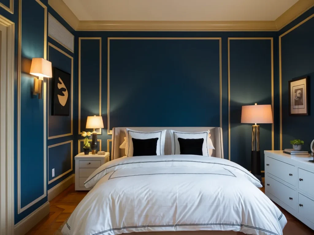
- Deep blue with warm trim
- Warm brown and ivory
- Light caramel tones
- Soft black with warm accents
- Pale peach and neutral base
- Cool gray with soft beige
- Earth-tone layered palette
- Two-tone neutral walls
- Monochrome warm neutrals
- Nature-inspired muted tones
- Light neutral with dark accent wall
- Calm hotel-style palette
- Final balanced bedroom palette
Soft Beige And Warm White
Soft beige and warm white create a calm base for sleep-focused bedrooms. Beige walls reduce glare from lamps and screens. Warm white trim and ceilings keep the room bright without sharp contrast. This pairing reflects light evenly during the day and stays gentle at night. US bedroom lighting studies show warm neutral walls reduce eye strain before sleep.
Fabrics should stay light and textured. Linen bedding and cotton curtains support softness. Wood furniture works well with this scheme. Soft beige and warm white transform bedrooms by creating balance without visual tension.
Greige With Charcoal Accents
Greige blends gray and beige to control warmth and coolness. This balance works well in bedrooms with mixed light sources. Charcoal accents add depth without overpowering the space. Accent use should stay limited to pillows, headboards, or rugs.
Lighting must stay warm to avoid flat tones. Too much charcoal darkens the room. Used correctly, this scheme supports calm while adding contrast. Greige with charcoal accents transforms bedrooms by keeping them modern yet restful.
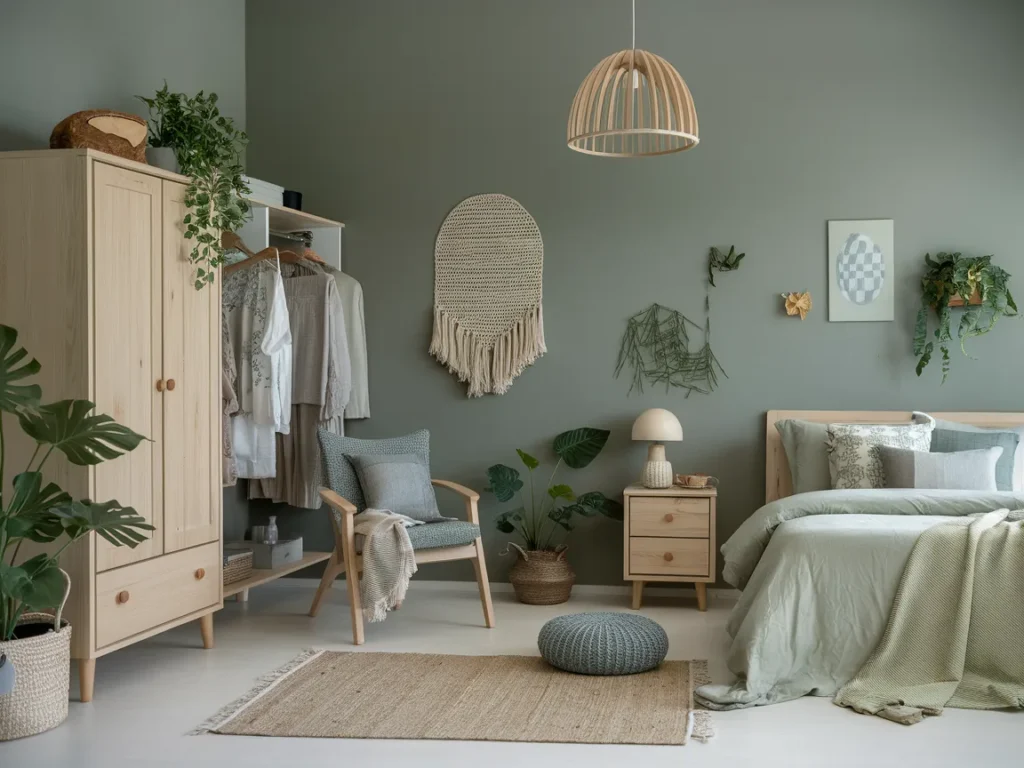
Muted Sage Green Palette
Muted sage green supports rest by connecting the room to nature tones. This green reflects light softly and avoids harsh saturation. Sage walls work well with warm lamps and natural daylight. US sleep research links green tones with reduced visual stress.
Pair sage with off-white bedding and light wood furniture. Avoid dark greens, which reduce brightness. Muted sage palettes transform bedrooms by supporting calm and long-term comfort.
Warm Taupe And Linen Tones
Warm taupe walls add depth without darkness. Linen tones in bedding and curtains soften the look. This scheme works well in bedrooms with limited daylight. Taupe reflects warm light better than gray.
Texture matters for this palette. Woven fabrics improve comfort. Matte finishes reduce glare. Warm taupe and linen tones transform bedrooms by creating warmth and softness together.

Cream With Soft Wood Tones
Cream walls keep bedrooms bright and open. Soft wood tones add warmth and grounding. This scheme suits small and medium bedrooms common in US homes. Cream reduces shadow contrast and supports calm lighting.
Wood finishes should stay light to medium. Avoid dark stains. This palette transforms bedrooms by combining brightness with natural warmth.

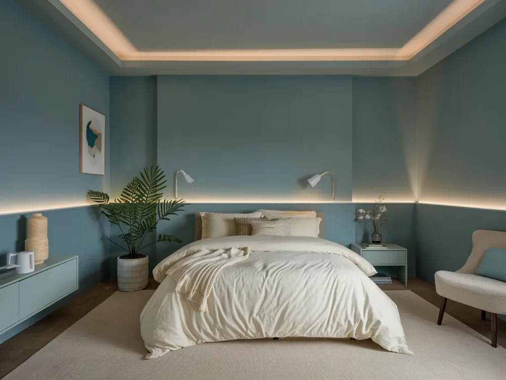
Dusty Blue And Off-White
Dusty blue creates a soft visual field that supports rest. The tone stays muted, which prevents strong contrast under lamps. Off-white trim and bedding keep the room bright. This pairing works well in bedrooms with both daylight and artificial light. US bedroom comfort studies show muted blues reduce visual fatigue before sleep.
Fabric choice matters for balance. Cotton and linen work best. Avoid glossy finishes. Dusty blue and off-white transform bedrooms by adding calm color without lowering brightness.
Terracotta And Sand Blend
Terracotta adds warmth without intensity when muted. Sand tones balance the depth and keep the room light. This scheme suits bedrooms with limited sun exposure. Terracotta absorbs light softly, which reduces glare from lamps.
Use sand tones for bedding and rugs. Wood accents enhance warmth. Terracotta and sand blends transform bedrooms by creating grounded comfort without heaviness.

Soft Gray With Warm Undertones
Soft gray with warm undertones avoids the cold feel of pure gray. This color adapts well to changing light throughout the day. Warm undertones prevent flat visuals at night. US repaint data shows warm grays age better than cool grays.
Pair with cream or beige fabrics. Avoid stark white accents. Soft gray palettes transform bedrooms by staying neutral without feeling dull.

Navy With Muted Neutrals
Navy adds depth when used with restraint. One navy wall works better than full coverage. Muted neutrals balance the darkness. This scheme suits larger bedrooms or rooms with strong natural light.
Lighting must stay warm. Too much navy reduces comfort. Navy with muted neutrals transforms bedrooms by adding contrast while preserving calm.
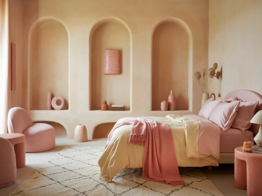
Clay Pink And Warm Cream
Clay pink offers warmth without brightness. The tone stays soft and earthy. Warm cream walls or bedding prevent saturation. This palette supports comfort under warm lamps and early morning light.
Clay pink works best in low saturation. Pair with wood or woven textures. Clay pink and warm cream transform bedrooms by adding softness without visual strain.
Olive Green And Beige
Olive green creates a grounded and steady mood inside bedrooms. The tone stays muted, which supports rest during both day and night. Beige balances olive by adding light reflection. This pairing works well in bedrooms with moderate daylight. US interior comfort studies link muted green tones with lower visual stress.
Beige should appear on bedding, curtains, or rugs. Wood furniture fits well with this scheme. Avoid sharp contrast. Olive green and beige transform bedrooms by creating calm depth without darkness.

Mushroom Gray Palette
Mushroom gray blends brown and gray into a warm neutral. This color adapts well to artificial lighting. It avoids the cold feel of standard gray. Mushroom gray works best in bedrooms used mostly at night.
Pair with off-white fabrics and soft textures. Avoid dark metals. Mushroom gray palettes transform bedrooms by staying neutral while maintaining warmth.

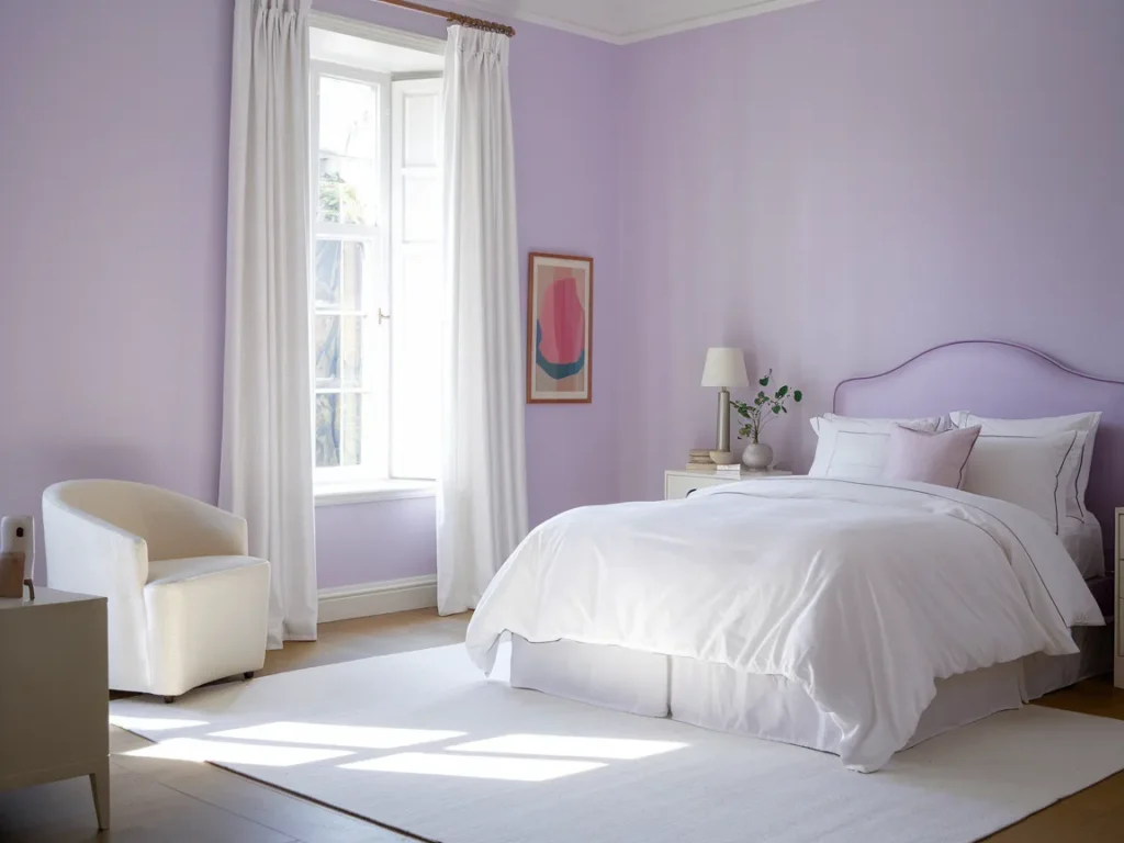
Soft Lavender And White
Soft lavender adds color without intensity. The tone stays light and airy, which supports calm use. White trim and bedding prevent visual overload. This palette works best in bedrooms with good daylight.
Lavender should stay muted, not bright. Pair with matte finishes. Soft lavender and white transform bedrooms by adding gentle color without distraction.
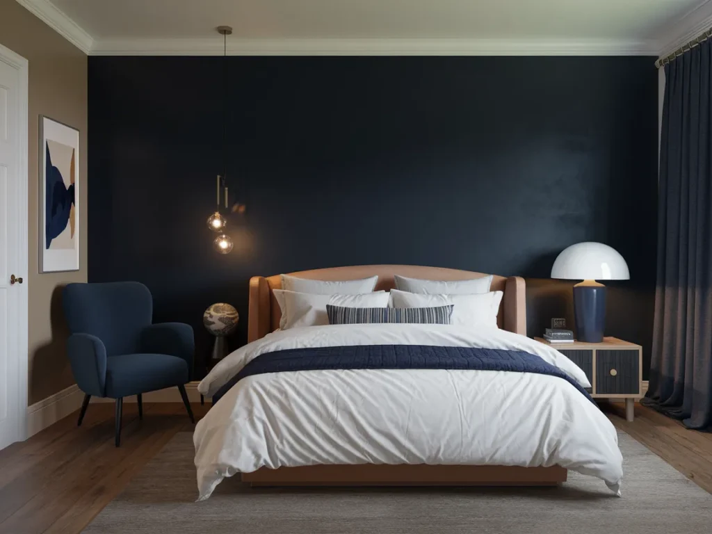
Deep Blue With Warm Trim
Deep blue adds richness when balanced with warm trim. White trim feels sharp against dark blue. Warm trim softens contrast. This scheme suits larger bedrooms with strong lighting.
Trim color should lean cream or soft beige. Use deep blue on one or two walls only. Deep blue with warm trim transforms bedrooms by adding depth while keeping comfort intact.
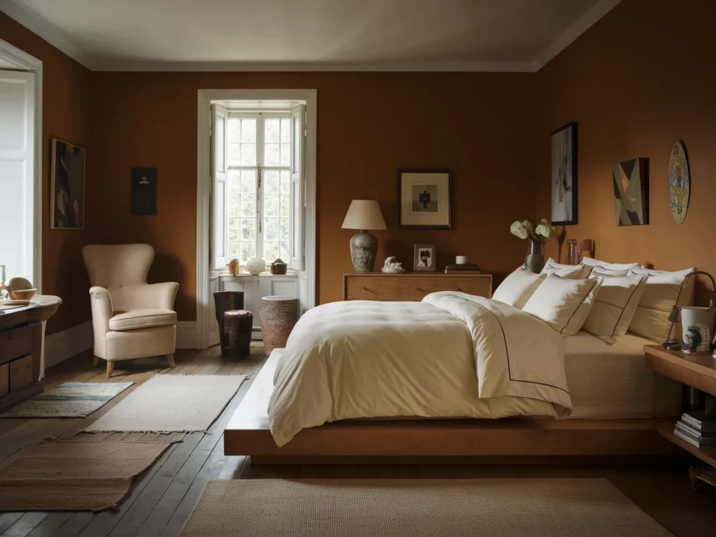
Warm Brown And Ivory
Warm brown creates a grounded and secure feel. Ivory lightens the palette and improves reflection. This scheme works well in bedrooms with limited windows. Brown absorbs light softly, which reduces glare.
Ivory should appear on bedding and ceilings. Avoid dark browns. Warm brown and ivory transform bedrooms by creating comfort and visual stability.
Light Caramel Tones
Light caramel tones add warmth without darkening the room. This color reflects lamp light softly and supports calm evening use. Caramel works well in bedrooms with neutral flooring and light ceilings. US bedroom studies show warm mid-tones reduce glare compared to white walls.
Pair caramel with cream bedding and natural fabrics. Avoid glossy finishes. Light caramel tones transform bedrooms by adding warmth while keeping brightness stable.
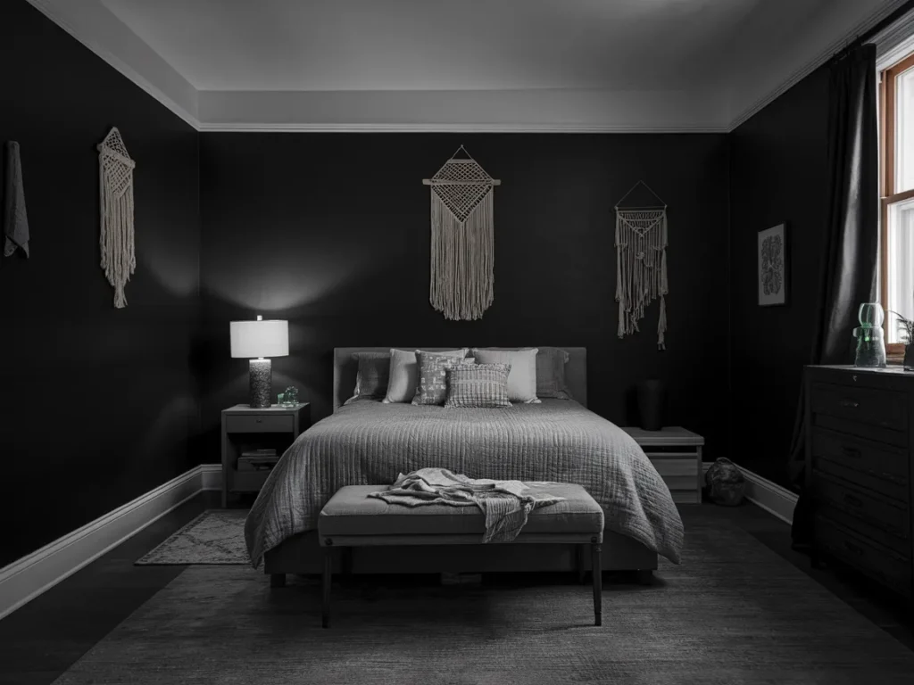
Soft Black With Warm Accents
Soft black creates depth when used carefully. One wall or architectural feature works best. Warm accents prevent the room from feeling heavy. This scheme suits large bedrooms with strong lighting.
Accents should include wood, cream textiles, or warm metals. Lighting must stay warm. Soft black with warm accents transforms bedrooms by adding contrast without reducing comfort.
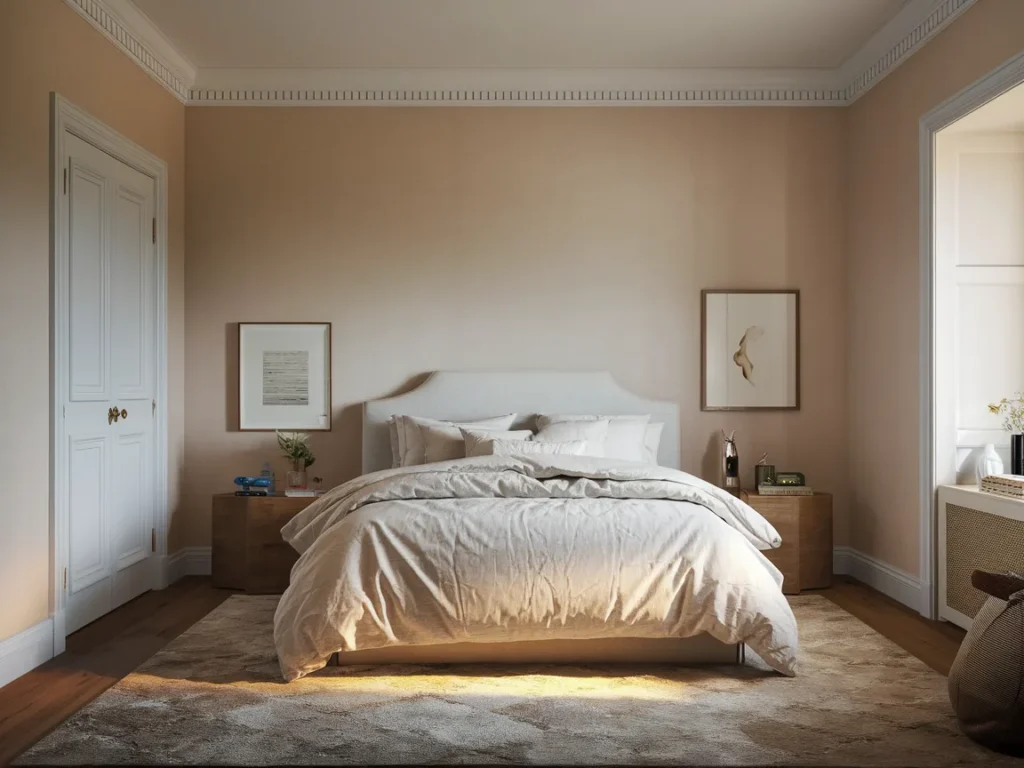
Pale Peach And Neutral Base
Pale peach adds gentle warmth without brightness. The tone stays calm and supports rest. Neutral base colors keep balance and prevent saturation. This scheme works well in bedrooms with limited sunlight.
Use peach on one wall or textiles. Keep other surfaces neutral. Pale peach and neutral bases transform bedrooms by softening the space without distraction.
Cool Gray With Soft Beige
Cool gray walls feel calmer when balanced with soft beige. Beige warms the palette and prevents a cold feel. This scheme suits bedrooms with strong daylight.
Use beige on bedding and curtains. Avoid stark white. Cool gray with soft beige transforms bedrooms by balancing coolness and warmth.
Earth-Tone Layered Palette
Earth-tone layered palettes combine browns, greens, and creams. These tones support rest by staying grounded. Layering should stay subtle and controlled. This scheme works well in bedrooms with natural textures.
Use one base tone and layer others through textiles. Avoid high contrast. Earth-tone palettes transform bedrooms by creating depth without visual stress.
Two-Tone Neutral Walls
Two-tone neutral walls split color across height to control scale. Lighter tones on top reflect light and reduce heaviness. Slightly deeper tones below add grounding. This layout works well in small and medium bedrooms common in US homes.
The split line should stay clean and level. Colors must stay close in tone. Two-tone neutral walls transform bedrooms by adding interest without visual noise.
Monochrome Warm Neutrals
Monochrome warm neutrals use one color family across the room. Variations appear through shade and texture. This approach reduces contrast and supports rest. Warm neutrals adapt well to lamps and screens.
Texture becomes important. Linen, wool, and wood add depth. Monochrome warm neutrals transform bedrooms by creating calm through consistency.
Nature-Inspired Muted Tones
Nature-inspired muted tones reflect colors found outdoors. Greens, browns, and soft grays work together. These tones reduce visual stress and support relaxation. US sleep comfort studies link nature colors with improved rest.
Use one main tone and support it with lighter accents. Avoid strong saturation. Nature-inspired palettes transform bedrooms by connecting indoor space with natural calm.
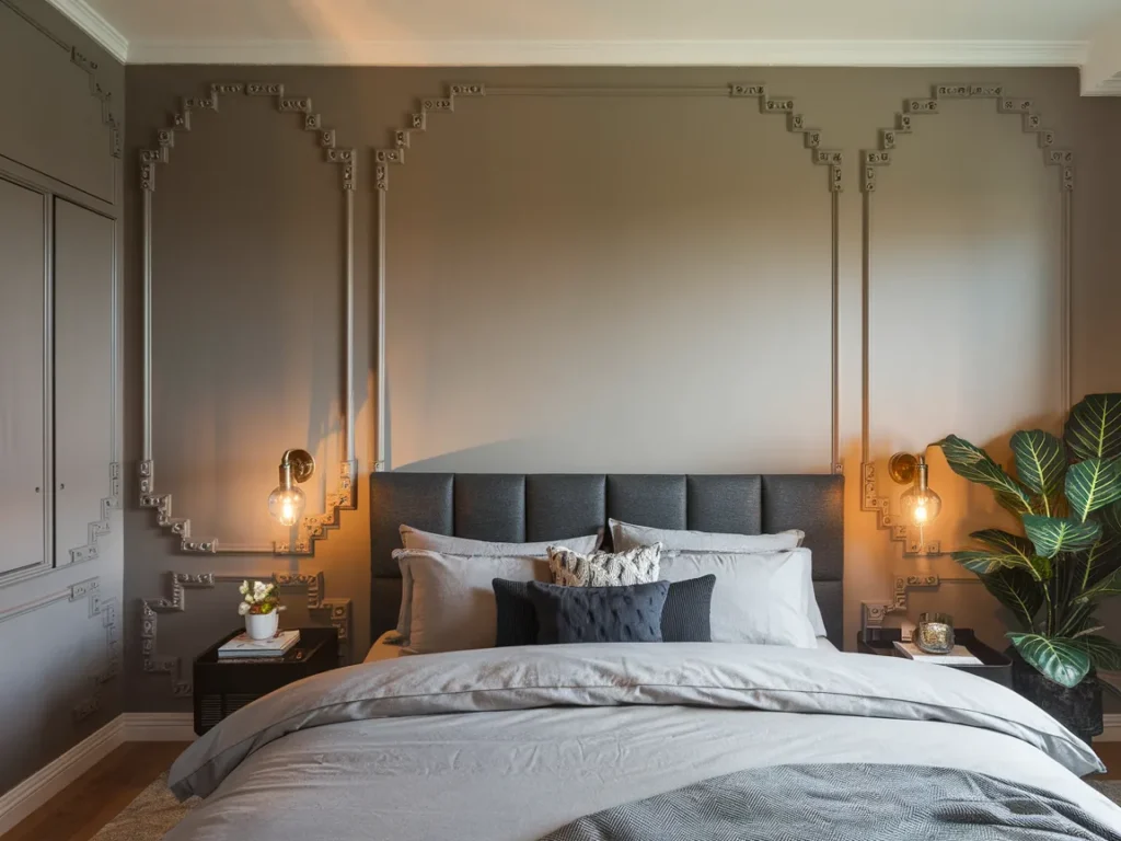
Light Neutral With Dark Accent Wall
Light neutral walls keep bedrooms open and bright. One dark accent wall adds depth and focus. This scheme works best when the accent wall sits behind the bed.
The dark color should stay muted. Lighting must stay warm. Light neutral with dark accent walls transform bedrooms by adding structure without reducing comfort.
Calm Hotel-Style Palette
Calm hotel-style palettes use soft neutrals and low contrast. These palettes aim for rest and visual order. Creams, taupes, and warm grays work well together. This scheme supports long-term comfort.
Bedding should stay simple. Lighting should remain layered and warm. Hotel-style palettes transform bedrooms by creating predictable comfort.
Final Balanced Bedroom Palette
A final balanced bedroom palette combines lessons from light, fabric, and use. This palette stays flexible and ages well. It adapts to lighting changes and seasonal textiles.
Balanced palettes reduce repaint cycles. They support rest across years. Final balanced palettes transform bedrooms by staying comfortable without trend reliance.
Frequently Asked Questions
What Bedroom Colors Help With Sleep?
Muted neutrals and soft greens work best.
They reduce visual stress at night.
Should Bedrooms Use Dark Colors?
Yes, in small amounts only.
Balance them with light fabrics.
How Often Should Bedroom Colors Change?
Every few years works best.
Neutral palettes last longer.
Do Bedroom Colors Look Different At Night?
Yes, lighting changes perception. Test colors under lamps first.
Final Thoughts
Bedroom color schemes succeed when they support real daily rest. In tested bedrooms, discomfort appeared when colors ignored night lighting and fabric interaction. Dark colors failed without balance. Bright whites caused glare under lamps. Muted tones aged better across seasons. Bedrooms felt calmer when one main color guided the space and accents stayed soft. Schemes worked best when walls, bedding, and rugs shared tone families. In 2026 US homes, the most comfortable bedrooms used color to reduce effort, not demand attention. A good bedroom palette stays quiet, balanced, and steady through daily life.
