

Home decor signs help a room feel finished by adding a clear message, soft detail, and wall balance. I use signs when a wall looks empty, a shelf feels flat, or an entry needs a simple focal point. The best signs match the room style and stay easy to read.
I started using signs about five years ago when my entryway wall sat blank for months. I tried art prints first, but they felt random next to the coat hooks and shoe bench. A simple wooden welcome sign pulled the whole corner together in one afternoon, and that taught me something I still follow: a sign works best when it answers a question the room is already asking. An empty wall above a console asks for a greeting. A bare kitchen wall asks for warmth. Match the message to the spot and the sign almost styles itself.
The other lesson took longer to learn. Cheap signs with thin lettering and glossy finishes photograph terribly and peel within a year, especially in kitchens and bathrooms where steam gets into everything. Now I check three things before buying: sealed or painted lettering (not vinyl stickers on raw wood), a frame or finished edge, and a hanging method that does not rely on a single nail. Those three checks have saved me from every bad sign purchase since. Everything below follows the same approach: real placements I have tested, with the sizes and finishes that actually hold up.
15 Home Decor Signs Ideas
- Welcome sign for the entrance
- Family name sign for the living room
- Kitchen quote sign above the counter
- Laundry room sign above the washer
- Bathroom sign with clean text
- Bedroom sign with soft words
- Coffee bar sign for a drink corner
- Entry hook sign for daily routine
- Pantry label sign for storage
- Kids room name sign
- Seasonal sign swap setup
- Wood sign on a shelf lean
- Neon sign for modern vibe
- Minimal sign for neutral homes
- Small sign styling rule
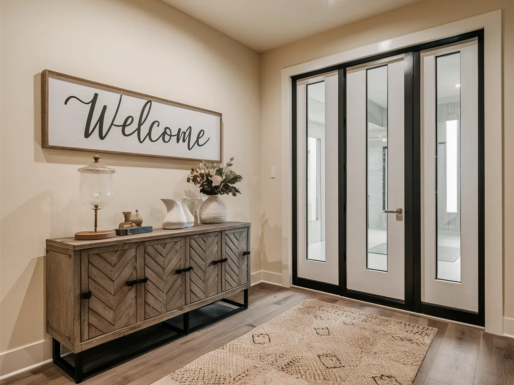
Welcome Sign For The Entrance
A welcome sign makes the entrance feel friendly and complete. I placed a simple sign near the door or above a console table so guests saw it right away. A reminder sign also helps the space feel styled without adding clutter. Neutral colors work best because they match most entry decor themes.
I hang welcome signs at about 60 inches from the floor to the center, which is eye level for most adults and photographs well. If your console table is 36 inches wide, look for a sign between 24 and 30 inches wide so it stays proportional. For finishes, I like sealed wood or metal near front doors because temperature swings make raw wood warp. One mistake I see a lot: people center the sign on the wall instead of on the furniture below it. Always align with the console or bench, not the wall, or the sign looks like it is floating. For more entryway styling ideas, see my entryway table decor ideas.
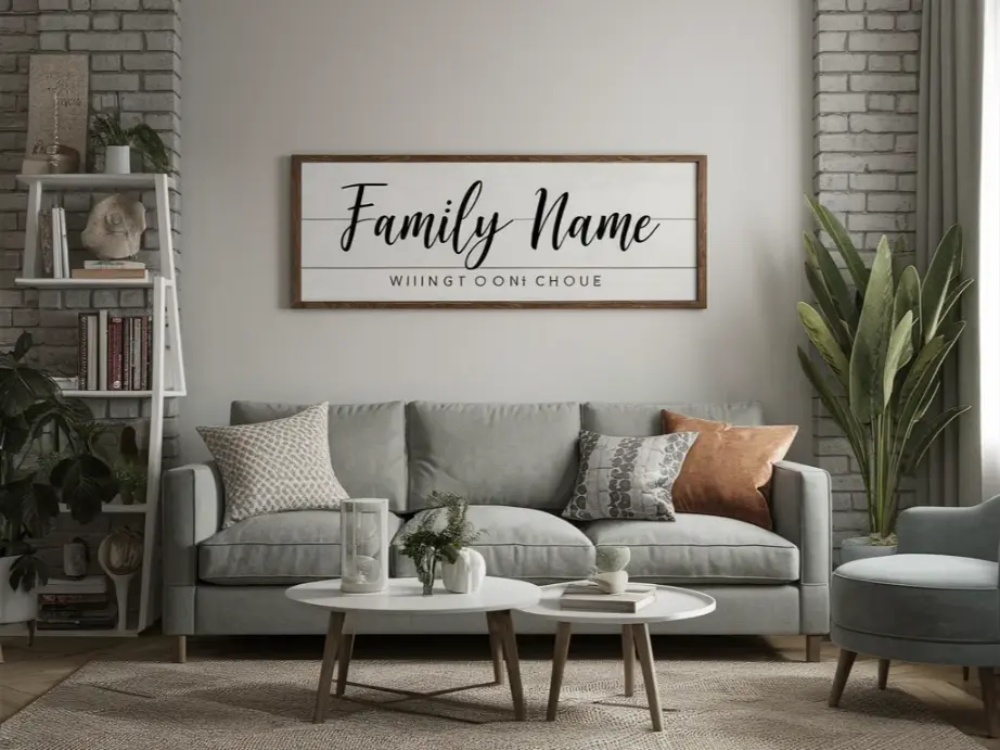
Family Name Sign For The Living Room
A family name sign adds a personal touch while keeping the living room calm. I used a clean font and a simple frame so the sign looked neat in photos. This idea works well above a sofa, fireplace, or gallery wall zone. Keeping the sign size balanced helps the wall feel complete without crowding.
For a family name sign, lettering style matters more than the words. Script fonts look elegant in photos but turn into a blur from across the room, so I use script only for short names and block letters for anything longer. Above a sofa, leave 6 to 8 inches between the top of the sofa and the bottom of the sign, and keep the sign to about two thirds of the sofa width. I once hung one too high and it looked disconnected from everything below it. Lower is almost always better. Matte black or warm wood tones work in most living rooms without fighting the other decor.
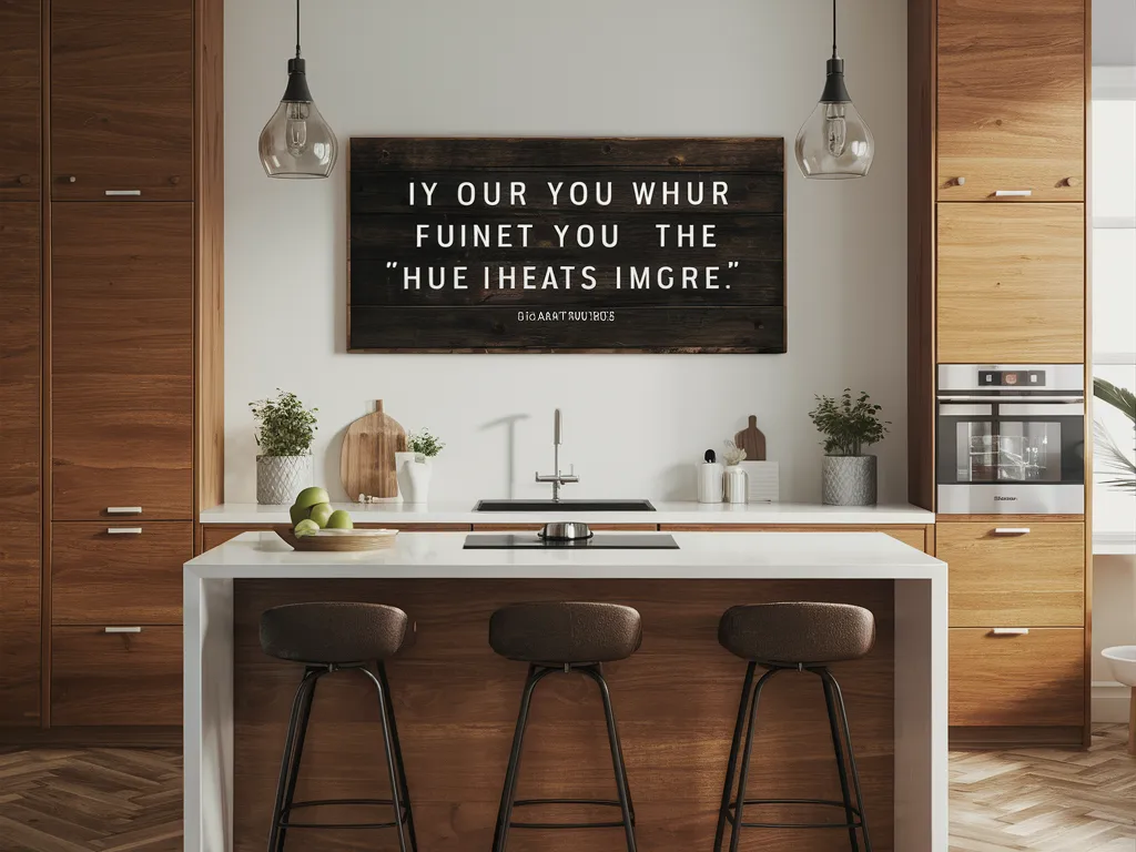
Kitchen Quote Sign Above The Counter
A kitchen quote sign makes the kitchen feel warm without using extra counter space. I placed the sign above a coffee station or on a blank wall near cabinets. Short text works best because it stays easy to read. Black, white, or wood tones match most kitchen colors and styles.
Kitchens are the hardest room for signs because of steam, grease, and heat. I only use signs with sealed surfaces here: framed prints behind glass, metal signs, or wood sealed with polyurethane. Paper prints in open frames will curl within months above a stove. Placement-wise, the wall between upper cabinets is prime real estate, or the side of a pantry cabinet if you have open wall space. Keep quotes short. Three to six words read instantly while you are cooking, and a full sentence becomes visual noise. Wipe the sign down when you clean the backsplash and it will last for years.
Laundry Room Sign Above The Washer
A laundry room sign helps the space feel more styled and less like a storage area. I used a small sign above the washer and dryer so the wall looked finished. This idea works best with clean fonts and neutral colors. A short sign adds charm without making the room feel busy.
The laundry room is where signs earn their keep, because the room itself is all machines and blank walls. I mount the sign 8 to 10 inches above the washer lid so it clears the lid when it opens (measure this before drilling, I learned the hard way). Humor works great here: laundry puns and wash-dry-fold quotes make a chore room feel lighter. Since this room gets humid, I prefer metal signs or sealed wood, and I avoid anything with raised paper letters. If your machines are stacked, center the sign on the pair rather than on one machine. Pair it with a small shelf for detergent jars and the whole wall looks intentional. My laundry room organization ideas show how to style the shelves around it.

Bathroom Sign With Clean Text
A bathroom sign adds a small detail that makes the room feel complete. I used a simple sign with short text near the towel area or above the toilet. Clean fonts work best because bathrooms already have small spaces. Neutral sign colors match most tiles and counters.
Bathrooms need signs that can handle moisture, so I stick to three safe options: framed art behind glass, acrylic signs, or tiles with printed text. Anything on raw wood or canvas will spot and warp. Keep the message simple and the palette to two colors max, since bathrooms are small and busy signs overwhelm them. I like placing one sign above the towel bar or on the wall opposite the mirror, where you actually see it. Funny bath quotes are popular, but I have found calm spa-style wording ages better. You stop noticing a joke after a month, but a clean, simple design still looks good in a year.

Bedroom Sign With Soft Words
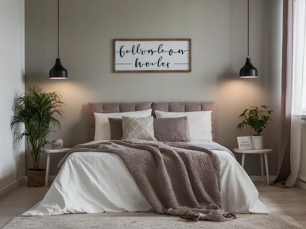
A bedroom sign helps set a calm mood when the message stays simple. I used soft words like “Rest” or “Sweet Dreams” above the bed or near a dresser. This idea works best with neutral colors and a light frame. Keeping the sign small prevents it from taking over the room.
Bedrooms call for quiet signs: soft words, muted colors, low contrast. I avoid high-contrast black on white here because it feels too energetic for a restful room. Instead I use tone-on-tone looks like cream lettering on natural wood or soft gray on white. Above the bed, center the sign on the headboard and keep it narrower than the bed itself. For renters, lightweight canvas signs or acrylic pieces hung with adhesive strips work well and come down cleanly. One rule I follow: if the bedroom already has patterned bedding and art, skip the sign. Signs shine in calm rooms and fight for attention in busy ones.
Coffee Bar Sign For A Drink Corner
A coffee bar sign makes a drink corner look clear and styled. I placed a small sign above the coffee setup so the station felt planned. This also helps the corner look better in photos for social posts. A short sign works best with clean mugs and a tray setup.
A coffee bar sign is the fastest way to make a drink corner feel like a real station instead of a cluttered counter. I mount mine 12 to 15 inches above the counter surface so it clears mugs and the coffee maker. Chalkboard-style signs are the classic choice and you can update the message, but real chalk dust gets everywhere near food, so I use chalk-look printed signs instead. Metal signs with coffee quotes also hold up well to steam. Keep the bar itself tight: machine, mugs on hooks, one small tray. The sign does the decorating so the counter can stay functional.

Entry Hook Sign For Daily Routine
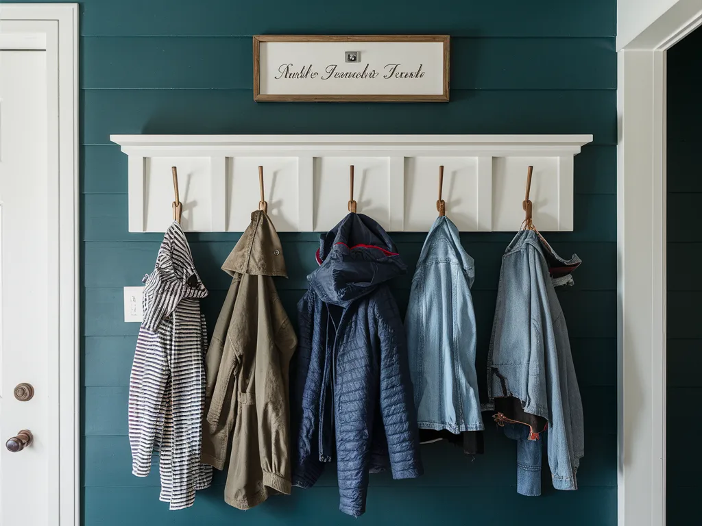
An entry hook sign adds function because it supports daily habits like hanging keys and bags. I used a sign above hooks that reminded everyone where items go. This kept the entry cleaner because fewer things landed on chairs. A simple sign works best when it matches the hook style.
This is the hardest-working sign in my house. A sign with hooks underneath holds keys, a dog leash, and sunglasses right by the door, which means I stop losing them. When buying one, check the hook weight rating: cheap versions sag under a heavy bag within weeks. I look for solid wood backing at least half an inch thick and metal hooks screwed in, not glued. Mount it into a stud or use proper wall anchors, because this sign takes daily pulling. Height matters too: 48 to 52 inches from the floor works for most adults without kids having to climb. If you have little ones, add a second lower row of hooks just for them.
Pantry Label Sign For Storage
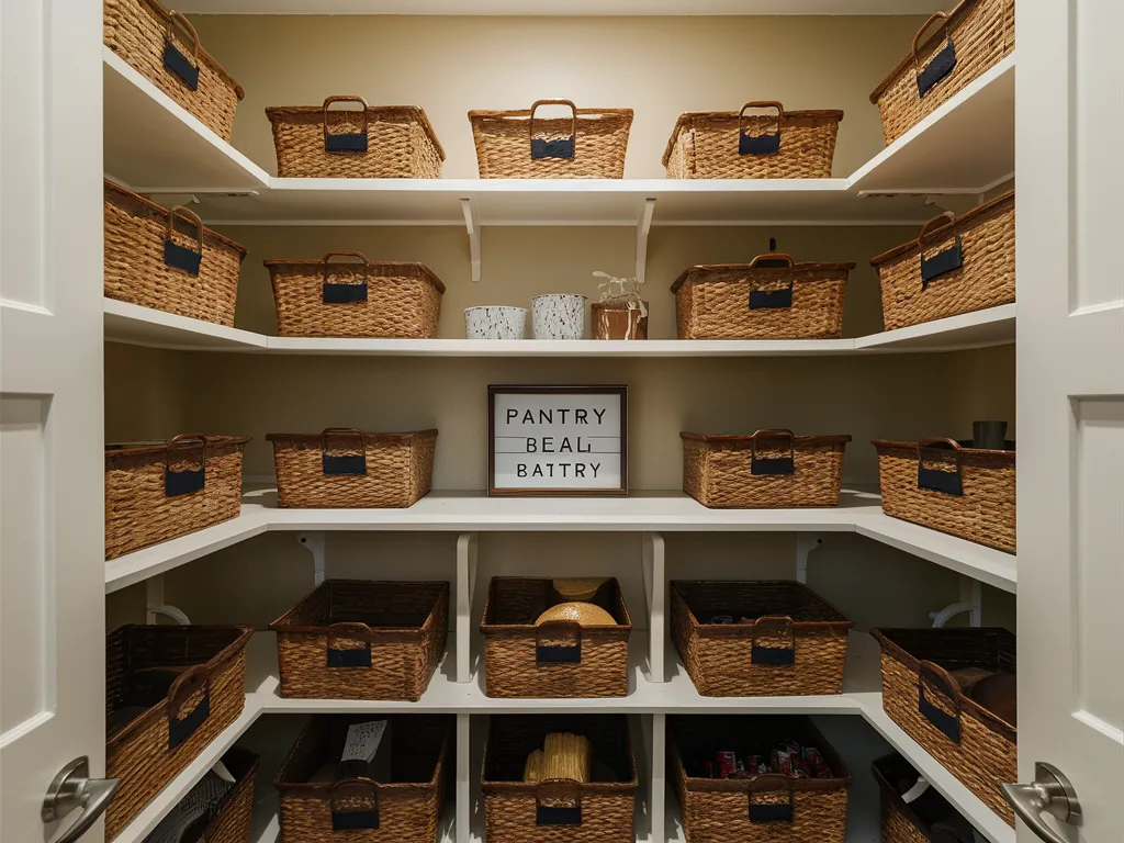
A pantry label sign helps storage look neat because it adds structure to shelves. I used simple labels on bins and containers so food items stayed easy to find. This made pantry shelves look clean and organized in photos. Short labels work best so the pantry stays easy to read.
Pantry labels only work if the system behind them is simple. I label broad categories (snacks, baking, canned goods) rather than every single item, because hyper-specific labels break the moment you buy a different brand. For the signs themselves, I use small chalkboard labels on bins and one larger pantry sign on the door or wall. Stick to a label maker or stencil for the text: handwriting looks charming for a week and then starts to bother you when it is inconsistent. Clear bins plus labels are the combination that actually keeps a pantry tidy, since you can see when something runs out. My pantry organization ideas walk through the full system.
Kids Room Name Sign
A kids room name sign adds a personal touch while keeping the space fun. I used a clean name sign above the bed or desk area. Simple colors helped the room stay calm instead of too bright. This idea also works well for shared rooms with two name signs.
Kids room name signs are the one place I go bold with color, because the room is already playful. Wooden cutout names painted to match the bedding are my favorite: they look custom without costing much. Mount with adhesive strips rather than nails so you can reposition as the room changes (and it will change). One practical tip: choose a finish you can wipe clean, because little hands touch these constantly. I also keep the sign away from the bed’s headboard area where pillows get thrown. Above a dresser or desk is safer. If the name is long, stack it in two lines rather than shrinking the letters to fit one line.

Seasonal Sign Swap Setup
A seasonal sign swap setup makes home decor easier because one spot stays ready for updates. I used one frame or sign holder and changed the message by season. This saved storage space and kept the home decor fresh. This idea works best on a console, mantel, or shelf area.
The trick to seasonal sign swaps is having one dedicated spot and a small storage system. I use a single picture ledge in the living room: the everyday sign lives there most of the year, and I swap in fall, holiday, and spring signs. Each seasonal sign gets stored in the same flat box with tissue between them so they do not scratch. Buy seasonal signs in the same size as your everyday sign so the spot always looks balanced. I limit myself to three seasonal swaps a year. More than that and you are storing decor instead of enjoying it. This one-swap-spot method keeps the house feeling fresh without turning storage into a second job.

Wood Sign On A Shelf Lean
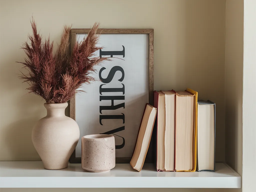
A wood sign leaning on a shelf adds warmth without hanging anything. I used a small wood sign behind a vase or books for a layered look. This made shelves feel styled without adding many items. Wood tones work best with neutral rooms and cozy decor styles.
Leaning a wood sign on a shelf instead of hanging it is my favorite renter-friendly trick. It takes ten seconds, needs no holes, and you can restyle endlessly. The key is the lean angle: about 10 to 15 degrees back against the wall, with the bottom edge at least 2 inches from the shelf edge so it cannot tip forward. Layer it in front of books or behind a small plant for depth. I keep leaned signs to one per shelf. Two leaned signs on the same shelf always look cluttered in my experience. Sealed wood works best here since shelves collect dust and you will be wiping around the sign. For more shelf styling, see my wood decor ideas.
Neon Sign For Modern Vibe
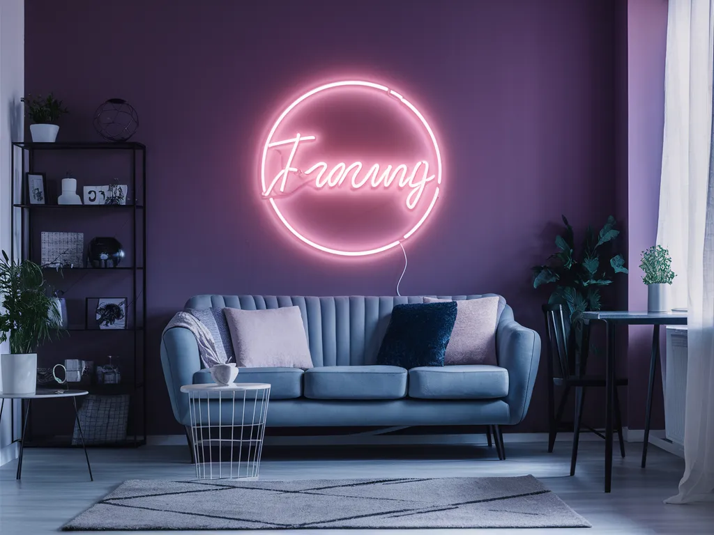
A neon sign adds a modern vibe and works well in game rooms, offices, or teen rooms. I used a short neon word sign on a blank wall to create a clean focal point. Neon works best when the rest of the room stays simple. This idea looks strong in photos because it adds glow and color.
Real glass neon is expensive and fragile, so nearly every home neon sign today is LED flex in a silicone tube, which is safer, cooler, and cheap to run. When shopping, check that it comes with a dimmer: full-brightness LED neon is harsh in a living room, but dimmed to half it gives a great glow. Mount with the included standoff screws or clear adhesive clips, and plan the cord route before you hang it, since the power cable is the part that ruins the look. I run mine down the wall edge and hide it behind furniture. One sign per room is the limit. Neon is a statement, and two statements argue with each other.
Minimal Sign For Neutral Homes
A minimal sign fits neutral homes because it blends in while still adding detail. I used thin frames and short text in black or beige tones. This kept the wall calm and not busy. Minimal signs work best in living rooms, bedrooms, and hallways with simple decor.
Minimal signs live or die on typography. With no color or decoration to hide behind, a cheap font looks instantly cheap. I look for signs with generous letter spacing and simple sans-serif or classic serif fonts. The sign itself should nearly disappear into the wall: white on white, cream on beige, soft gray on greige. Size it small, 12 to 18 inches wide, and give it empty wall space around it. Minimalism needs breathing room more than it needs objects. I hang these slightly lower than eye level, around 57 inches to center, which feels calm and gallery-like. If the wall has any texture, like shiplap or plaster, the sign picks up beautiful subtle shadows.
Small Sign Styling Rule
A small sign styling rule keeps decor clean and not crowded. I follow one simple method: use short text, match colors, and keep the sign size correct for the space. Signs look better when they have breathing room on the wall. This makes the room feel calm and styled.
The rule I come back to: a sign should be the second thing you notice in a room, never the first. If a sign screams for attention, it is too big, too bright, or too wordy for the space. Before I commit to a sign, I tape a paper template in the size I am considering and live with it for a day. This five-minute test has stopped more bad purchases than any other trick I know. And when a sign stops making you smile, take it down. Signs are the easiest decor to swap, so there is no reason to live with one you have stopped seeing. For reflective surfaces that pair well with signs, my mirror decor ideas are worth a look.
Frequently Asked Questions
Where Should I Put Home Decor Signs?
Home decor signs work best in entryways, kitchens, living rooms, and above shelves. Placing a sign near a routine area helps it feel natural. Keeping signs at eye level improves the look.
What Size Sign Works Best For Small Rooms?
Small rooms look best with medium or small signs. Large signs can overpower the wall and make the room feel crowded. A sign should match the furniture width below it.
How Do I Make Signs Look More Expensive?
Use clean fonts, neutral colors, and simple frames. Signs look better when the wall stays uncluttered. Layering a sign with a vase or books also adds style.
How Many Signs Should I Use In One Room?
One to two signs per room works best. Too many signs can make the room feel busy. Fewer signs help the decor feel calm and clean.
Can I Mix Different Sign Styles In One Home?
Yes, as long as each room keeps one consistent style. I use rustic wood signs in the kitchen, clean minimal signs in the bedrooms, and a modern neon piece in the living room. The mistake is mixing three styles in a single room, which looks accidental. Give each room its own sign personality and the whole house still feels connected through your color palette.
How Do I Hang A Heavy Wood Sign Safely?
Use two anchor points, never one. For drywall, I use toggle bolts rated for at least twice the sign weight, spaced 16 inches apart so they hit studs when possible. Heavy signs hung on a single nail tilt forward over time and eventually pull out. If the sign weighs more than 15 pounds, I add a French cleat, which locks it flat against the wall and makes leveling easy.
Conclusion
Home decor signs help rooms look finished by adding balance and clear detail. I got the best results with entrance welcome signs, kitchen signs, and simple shelf signs. Keeping fonts clean and colors neutral made signs fit many decor styles. When signs stay simple and spaced well, the home looks styled and photo-ready.
Start with one sign in the room you use most, live with it for two weeks, and notice whether the wall finally feels finished. That feeling is the whole point. Once you trust your eye on placement and size, adding signs to other rooms gets easy and fun. And if you are styling the wall around an entry console, my entryway console table ideas will help you finish the look.